SHISEIDO CREATIVE
Scope
Concept Development
Corporate Identity
Guidelines
Art Direction
Design
Credit
Design: Takaki Ikeda
Copy Writing: Miku Chikamori, Mike Burns
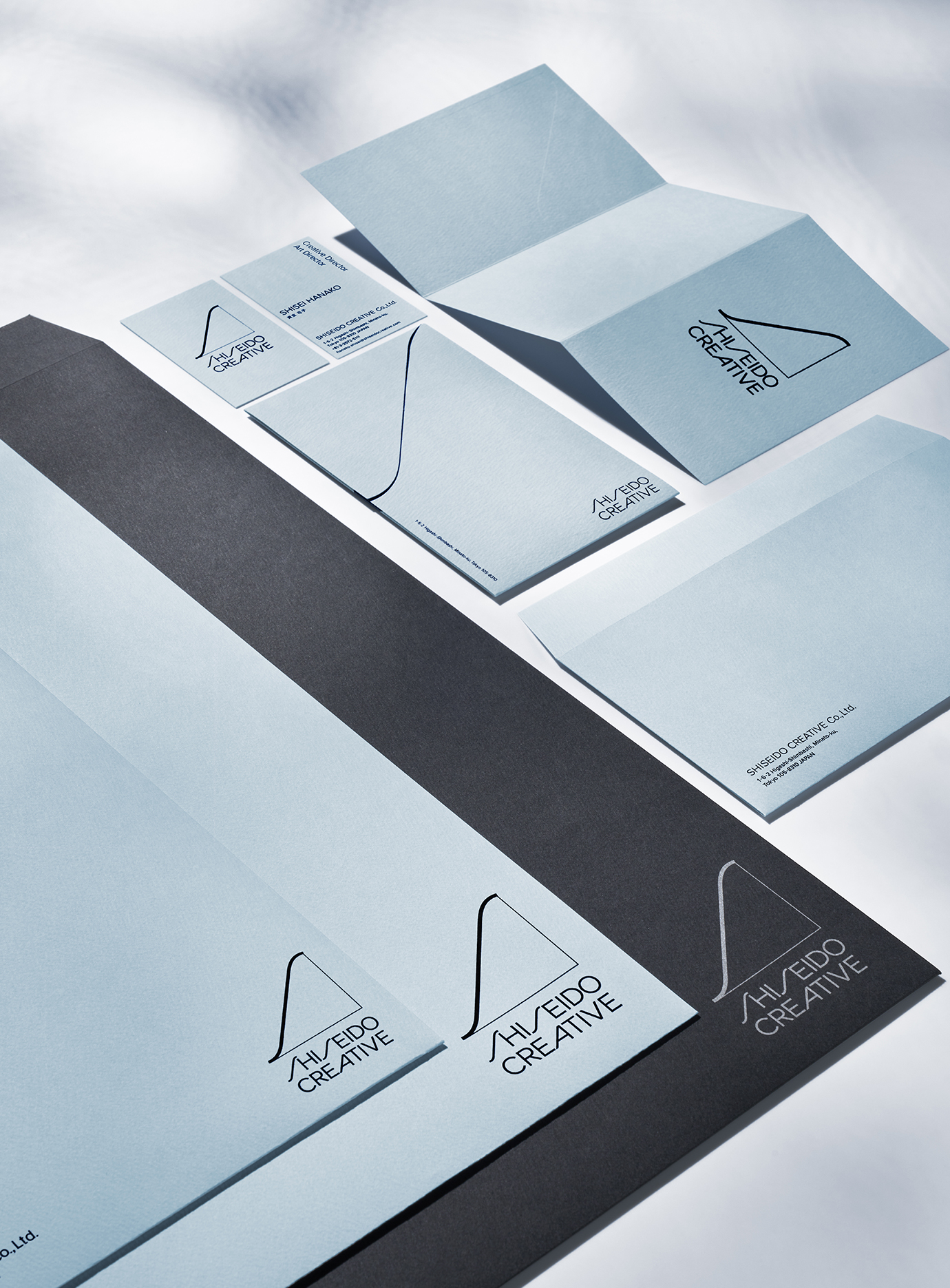
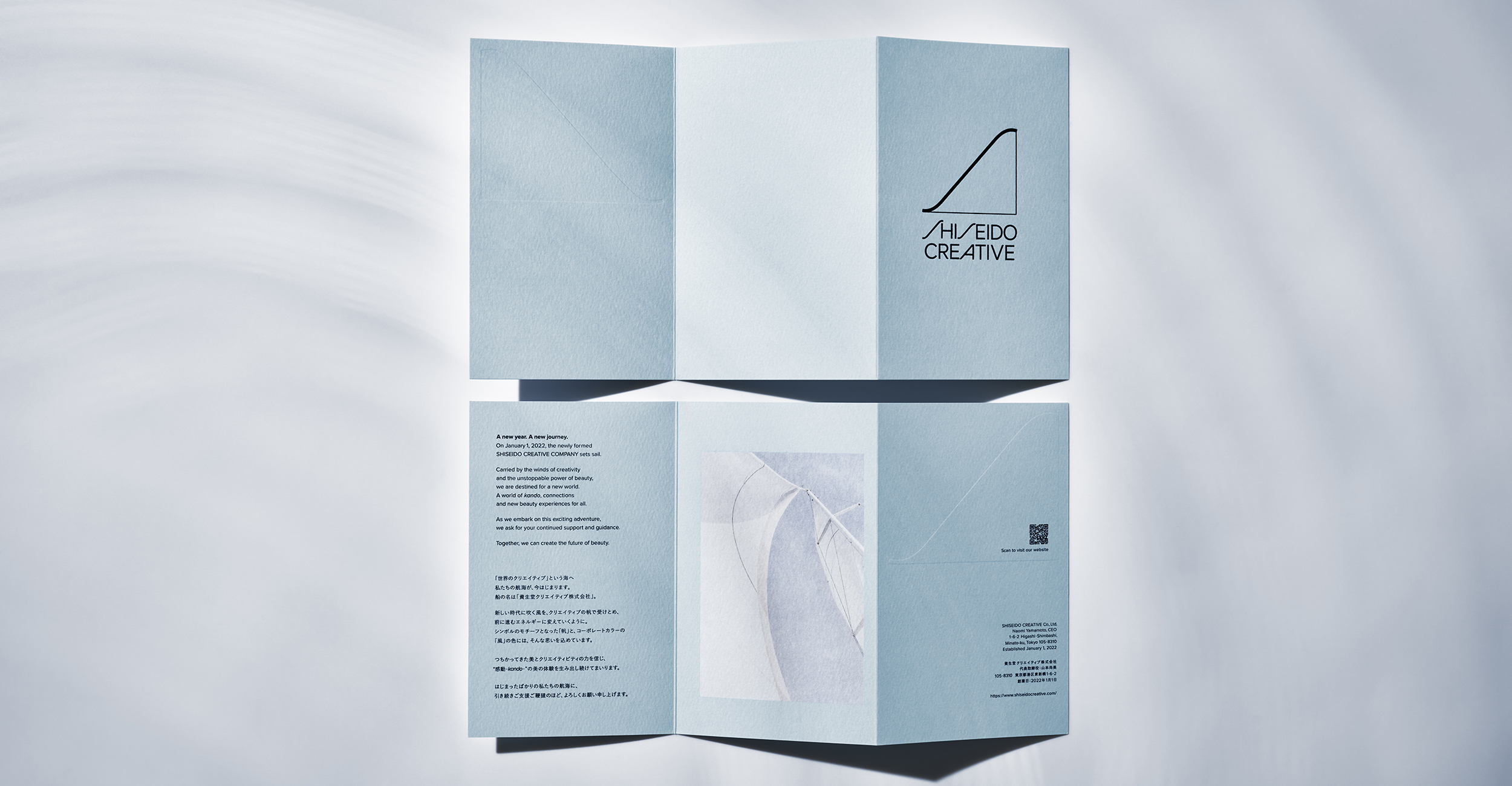
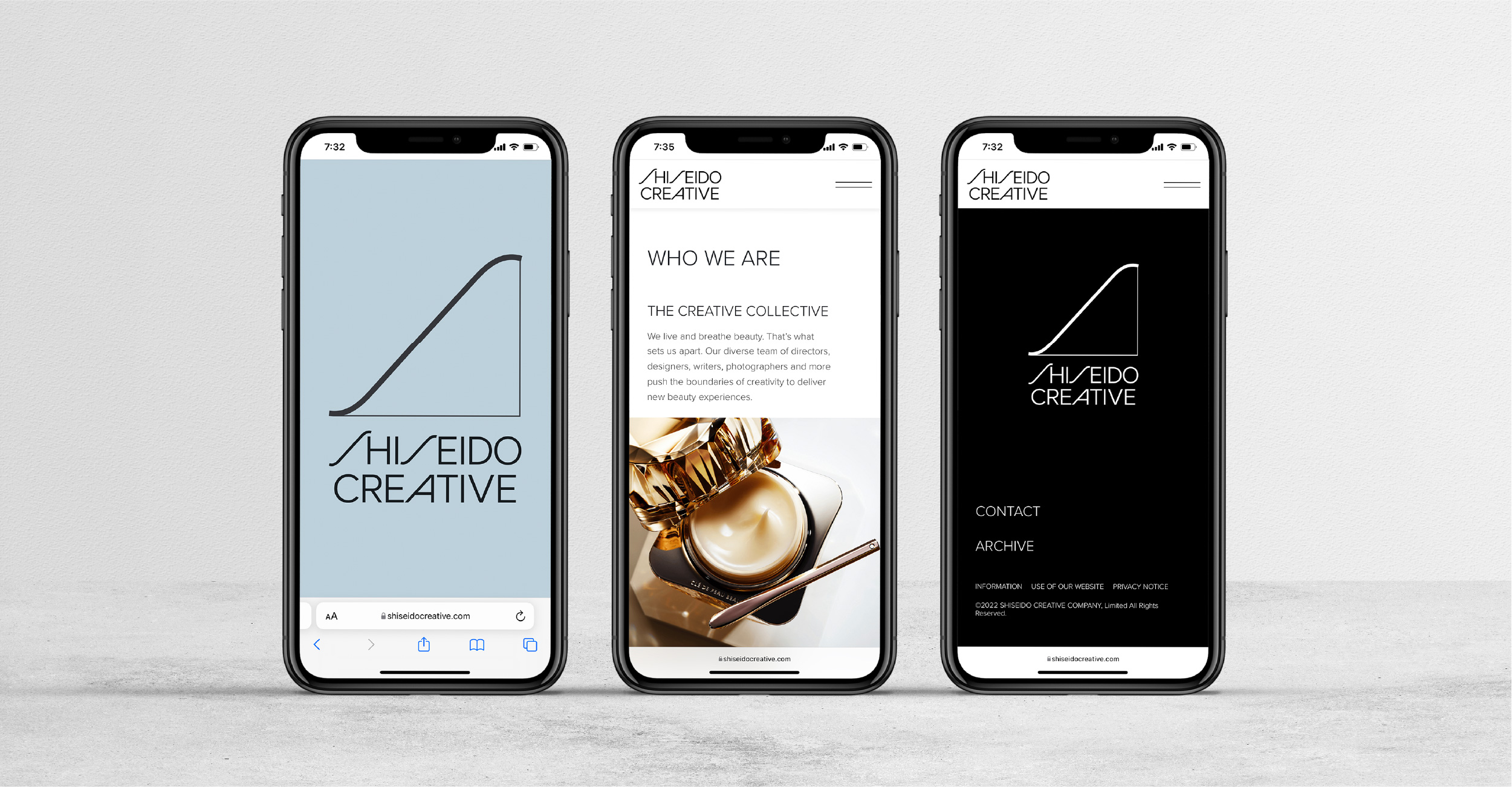
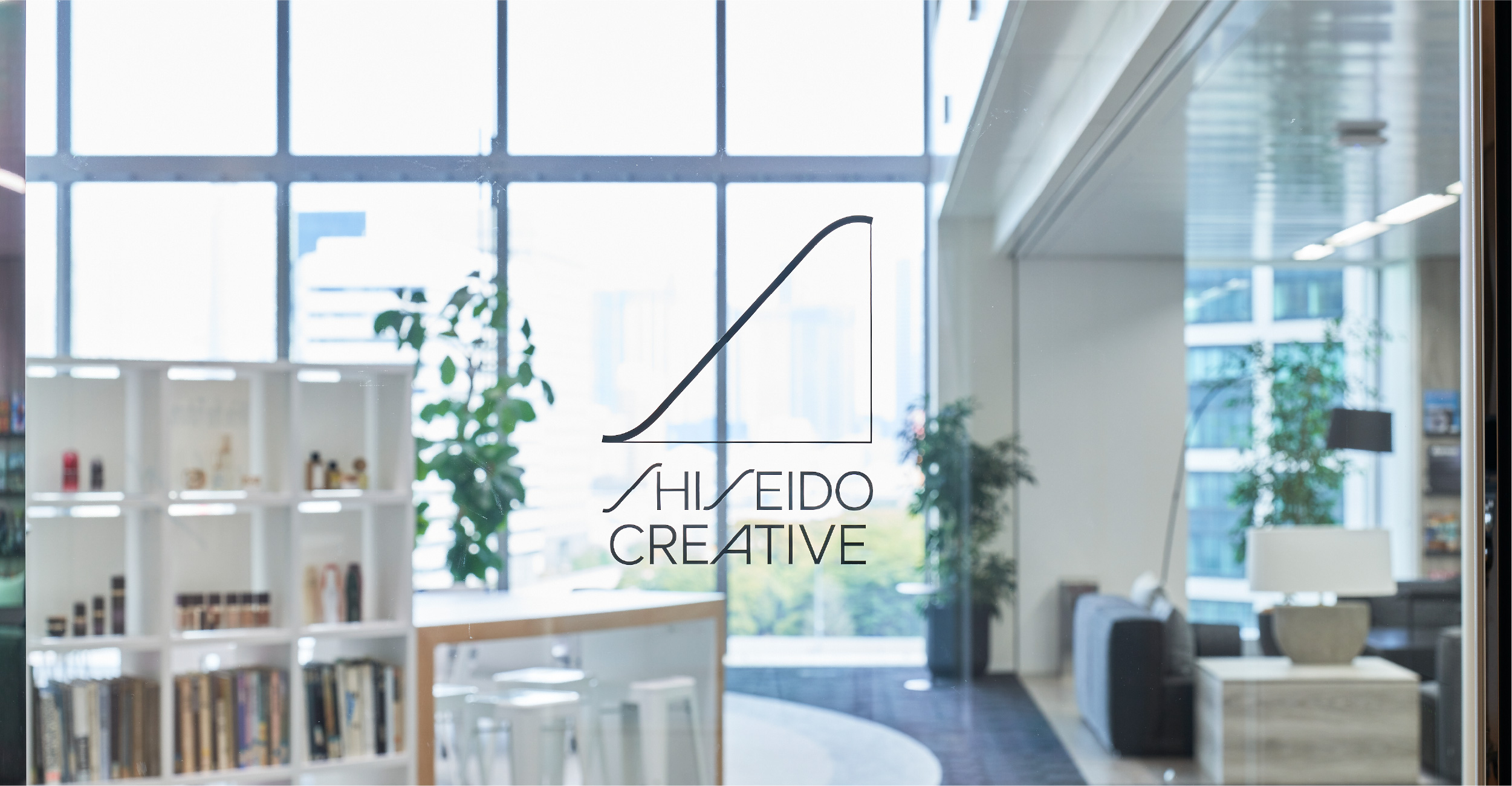
Shiseido Creative is a new creative company that has become an independent company from Shiseido in January 2022. In creating the corporate identity, we proposed a concept that serves as the core of the company.
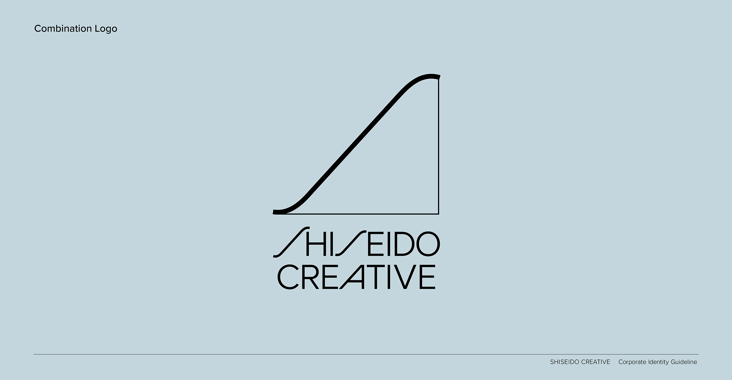
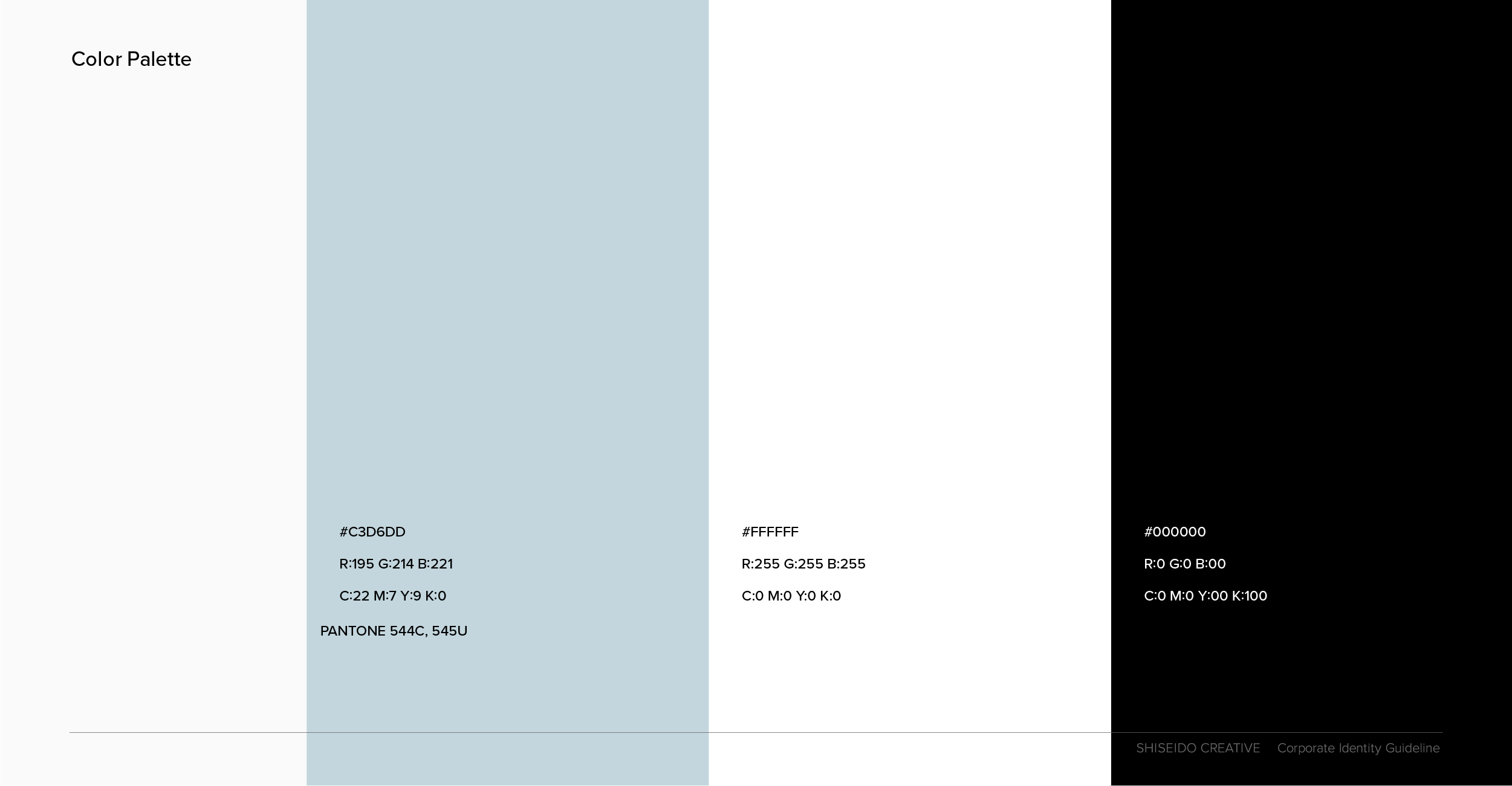
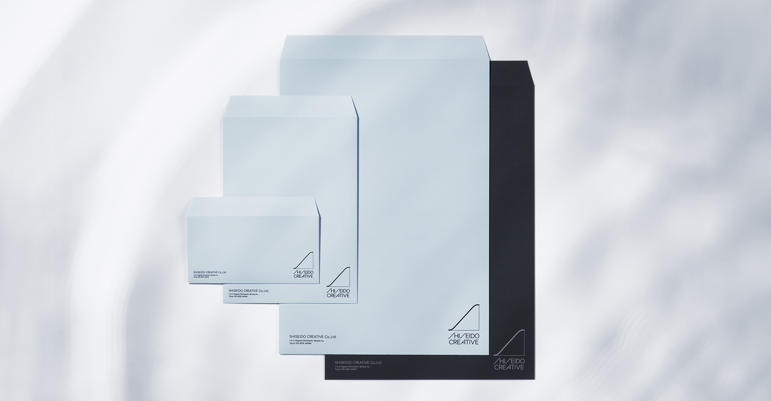
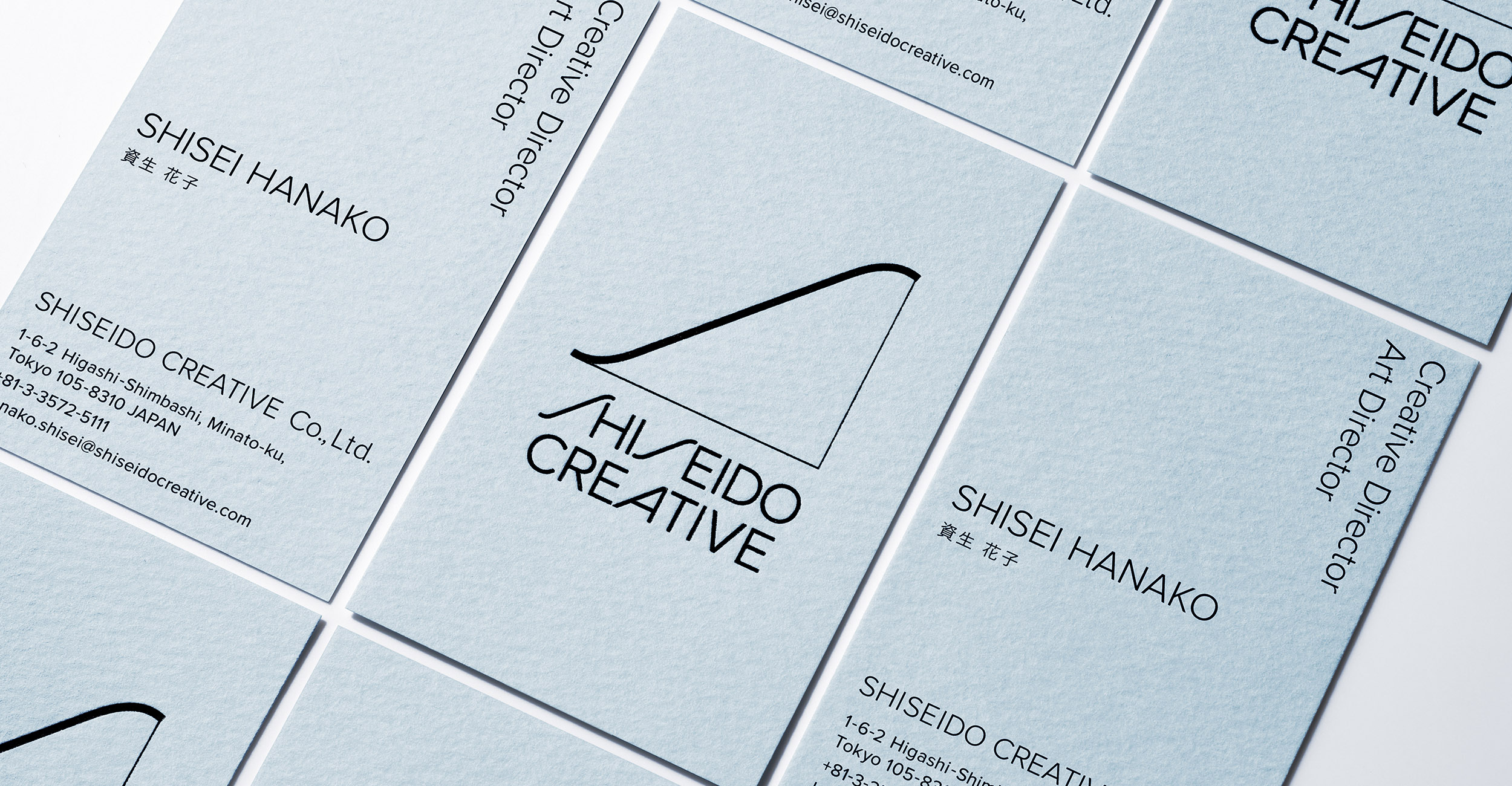
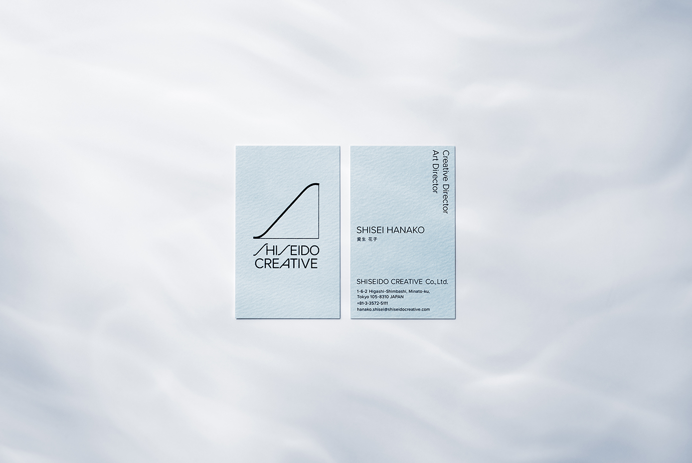
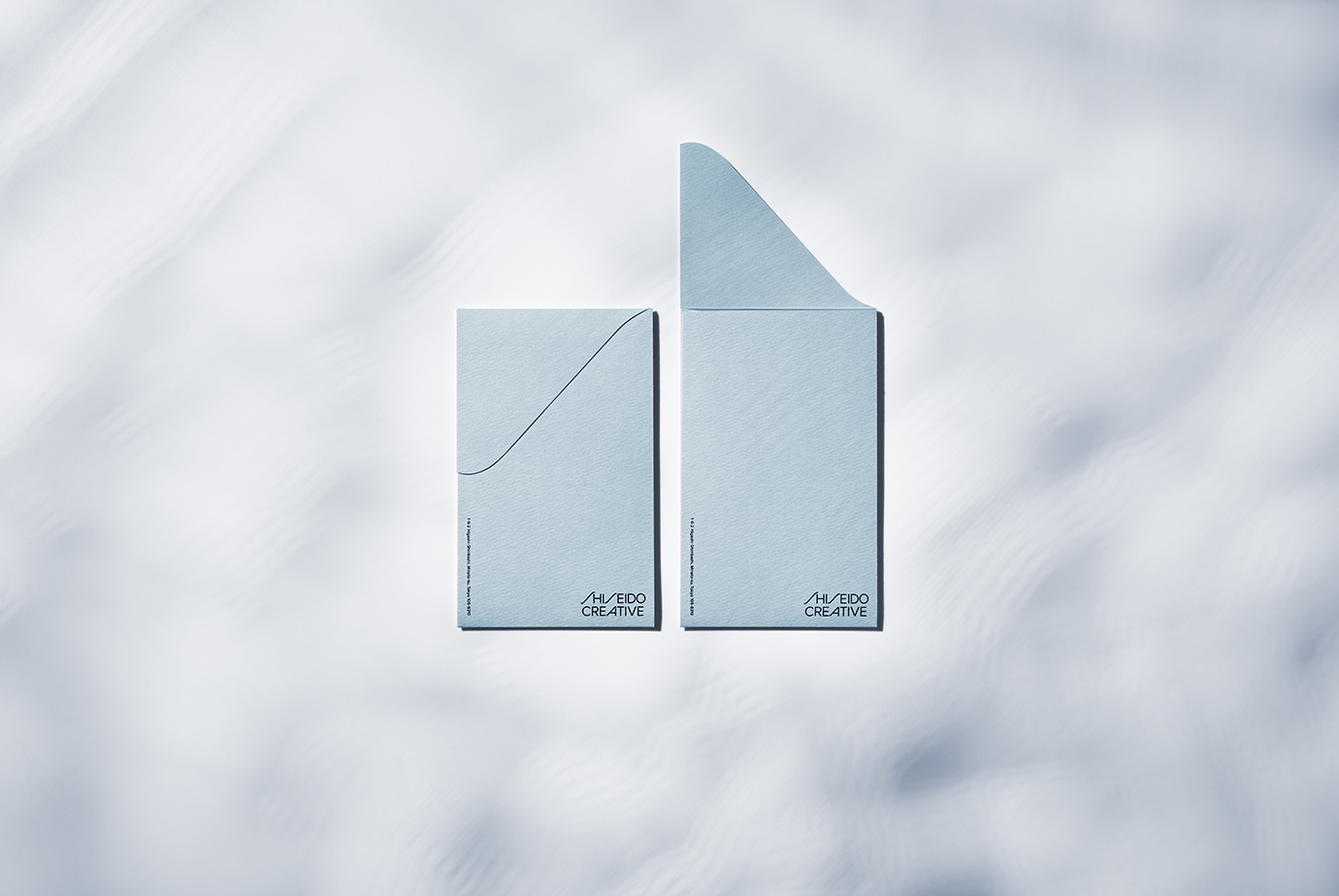
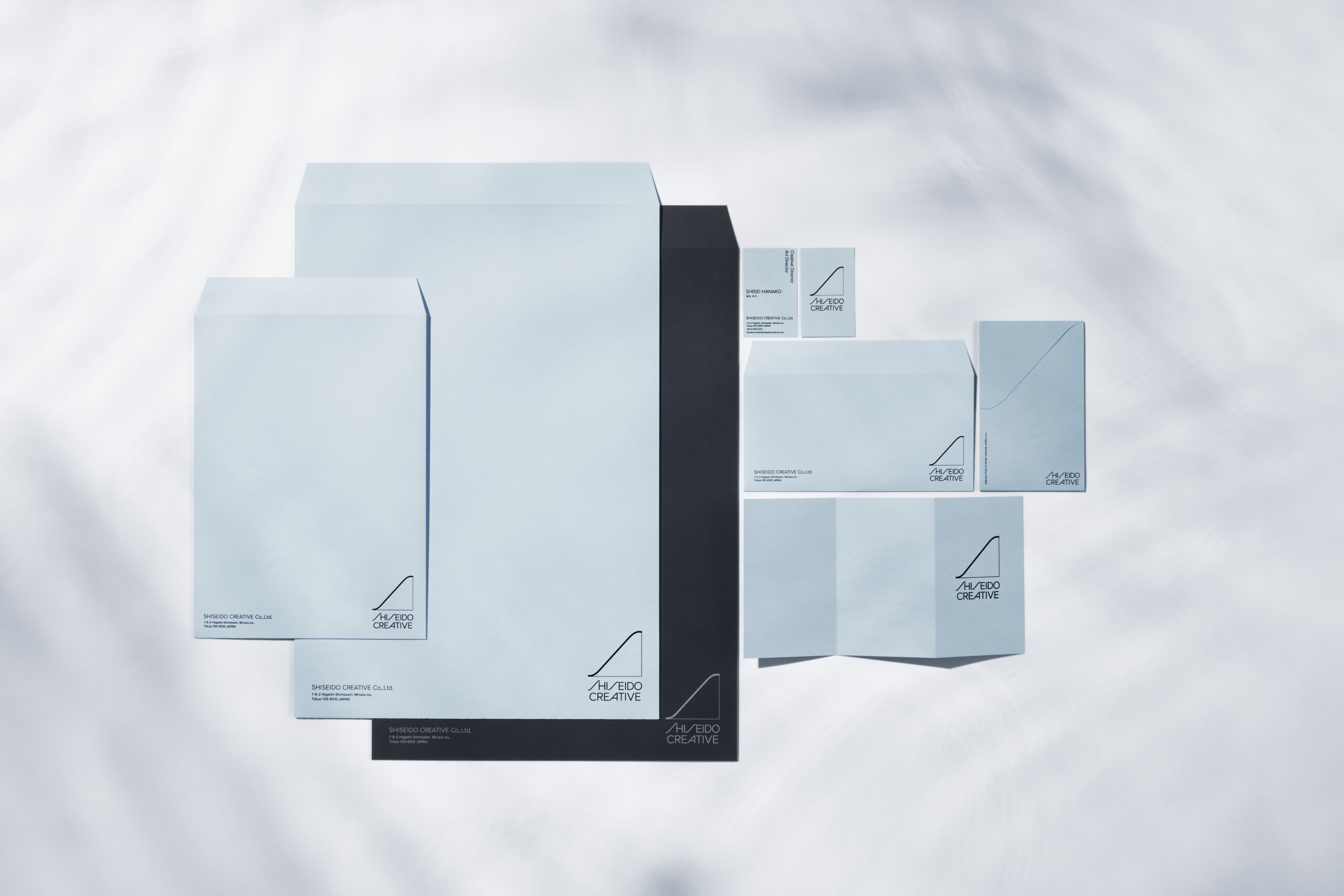
The logo of Shiseido Creative with the “S” of SHISEIDO represents the sail of a ship. A sail, in general, is designed to move a ship forward not only in a headwind but also in a tailwind. This logo was inspired by an image of a sail stretching to catch the wind of the new era and move us forward in any circumstances. The corporate color is blue inspired by the winds and is differentiated from Shiseido’s corporate color, red.