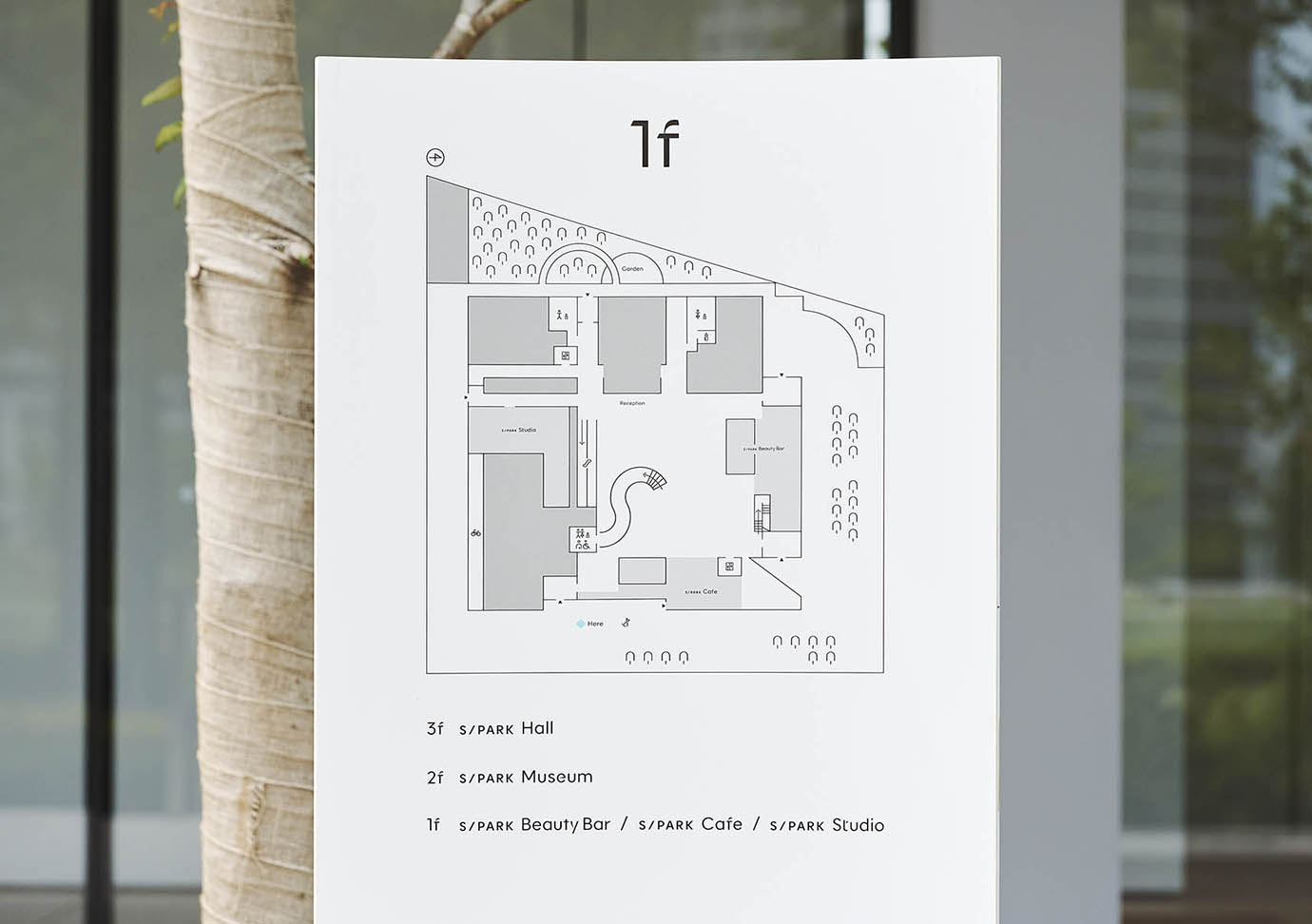
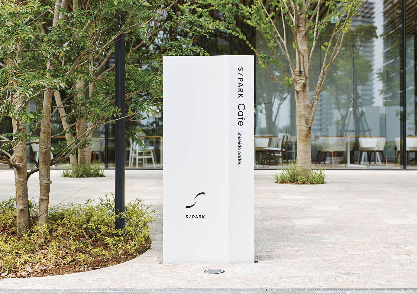
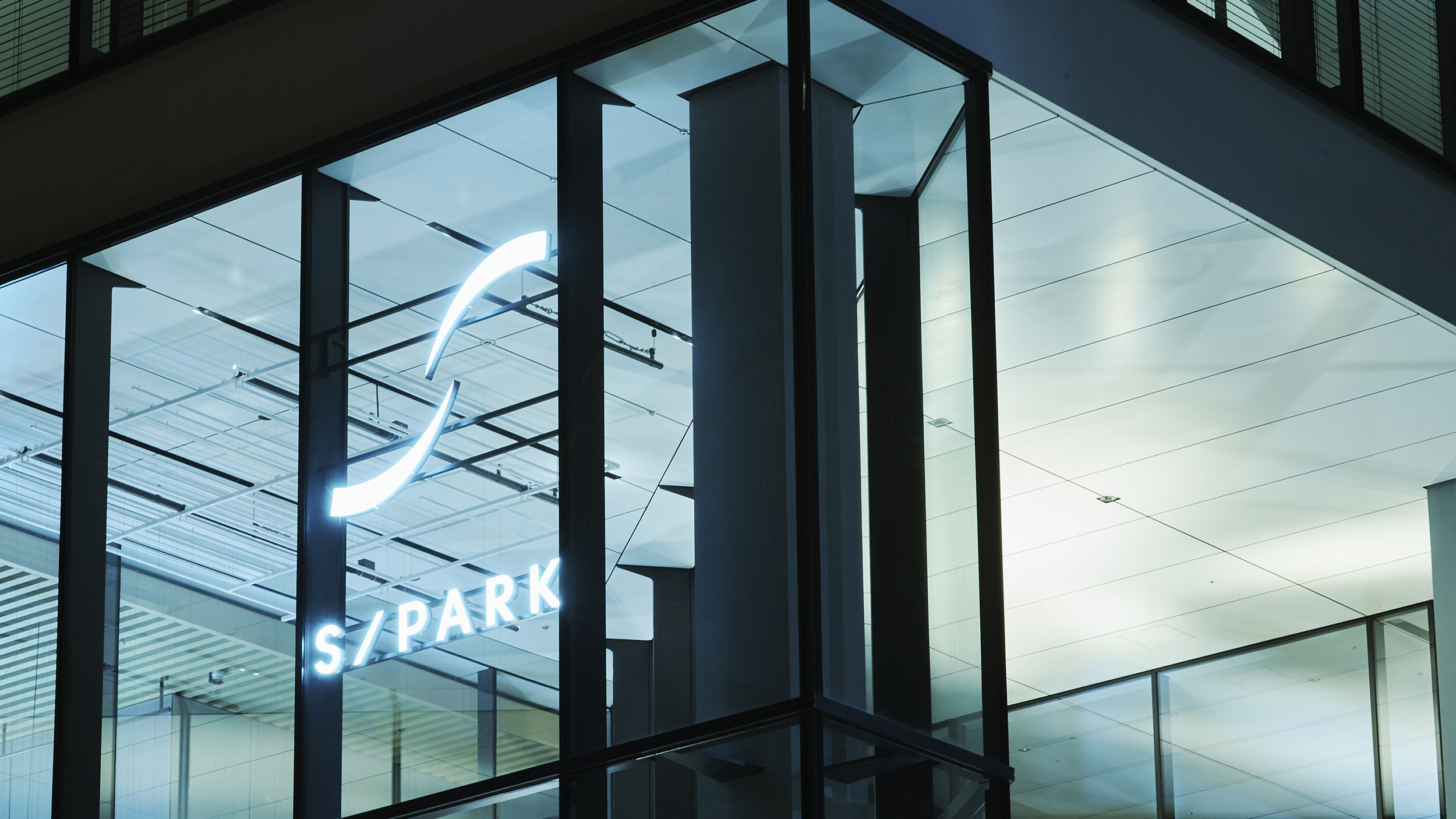
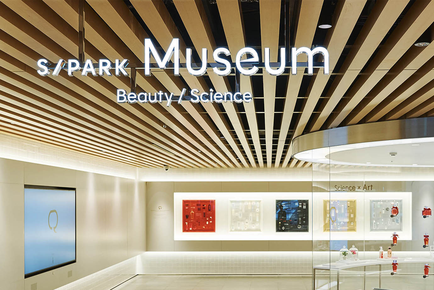
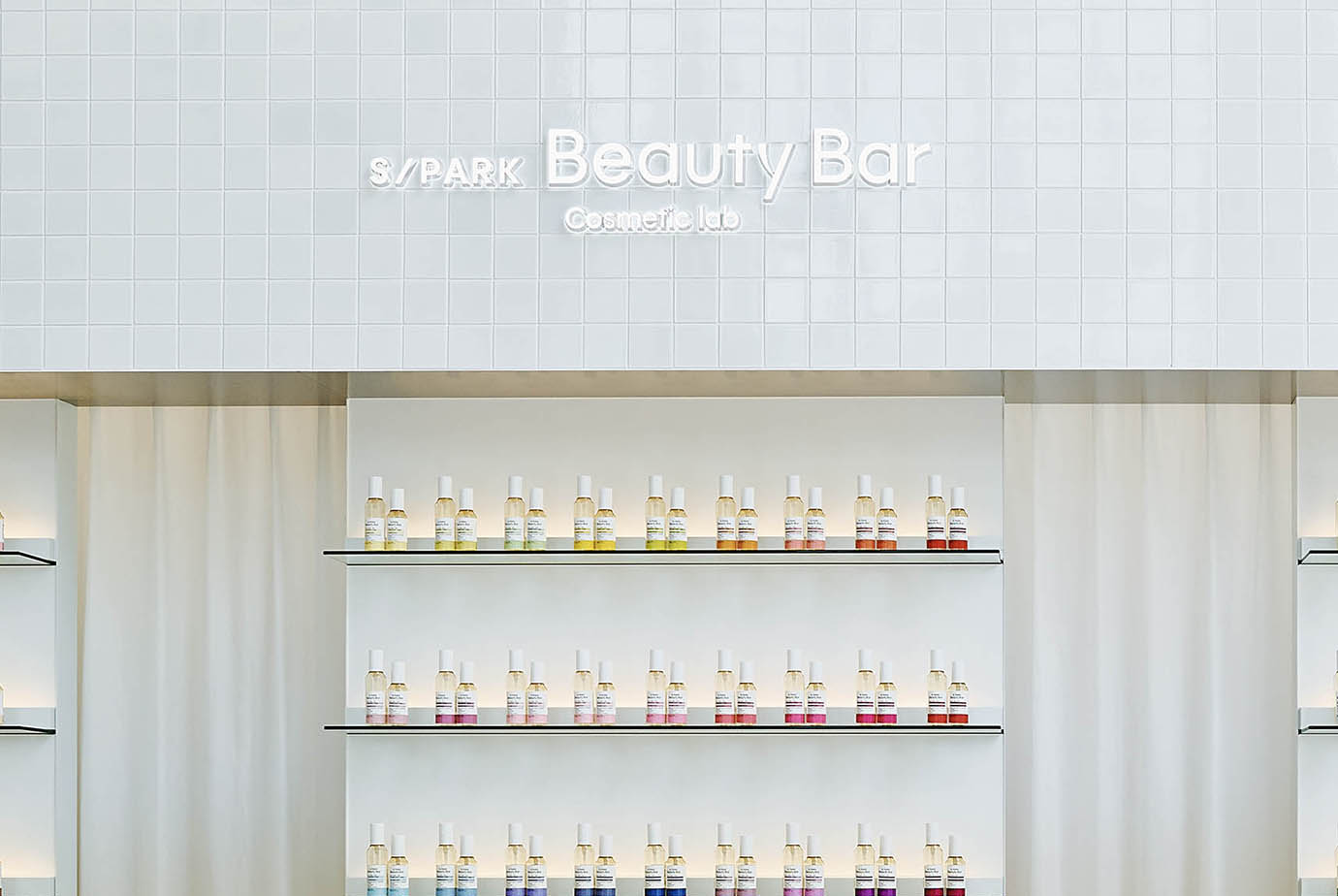
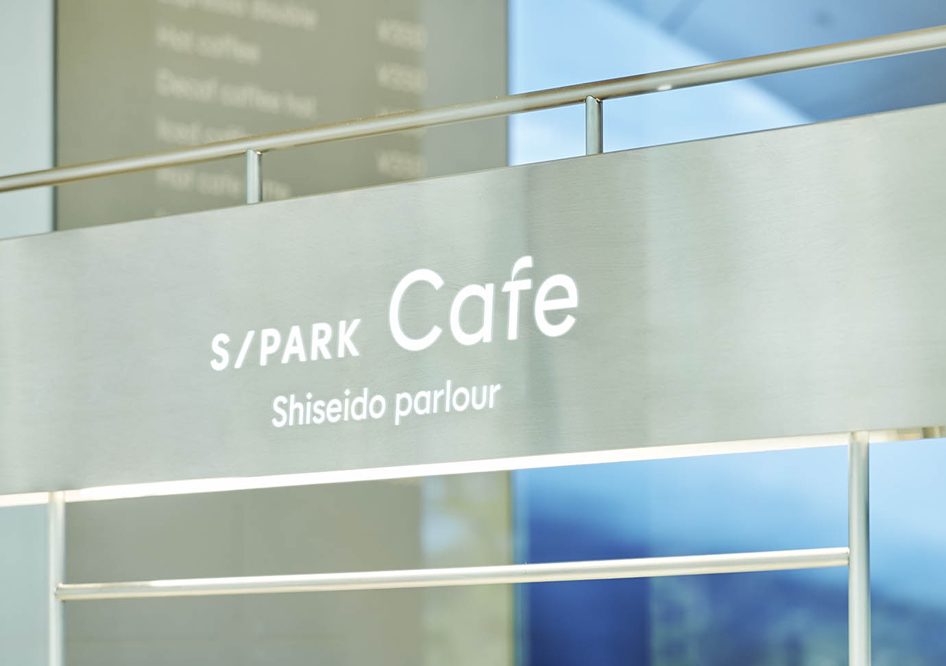
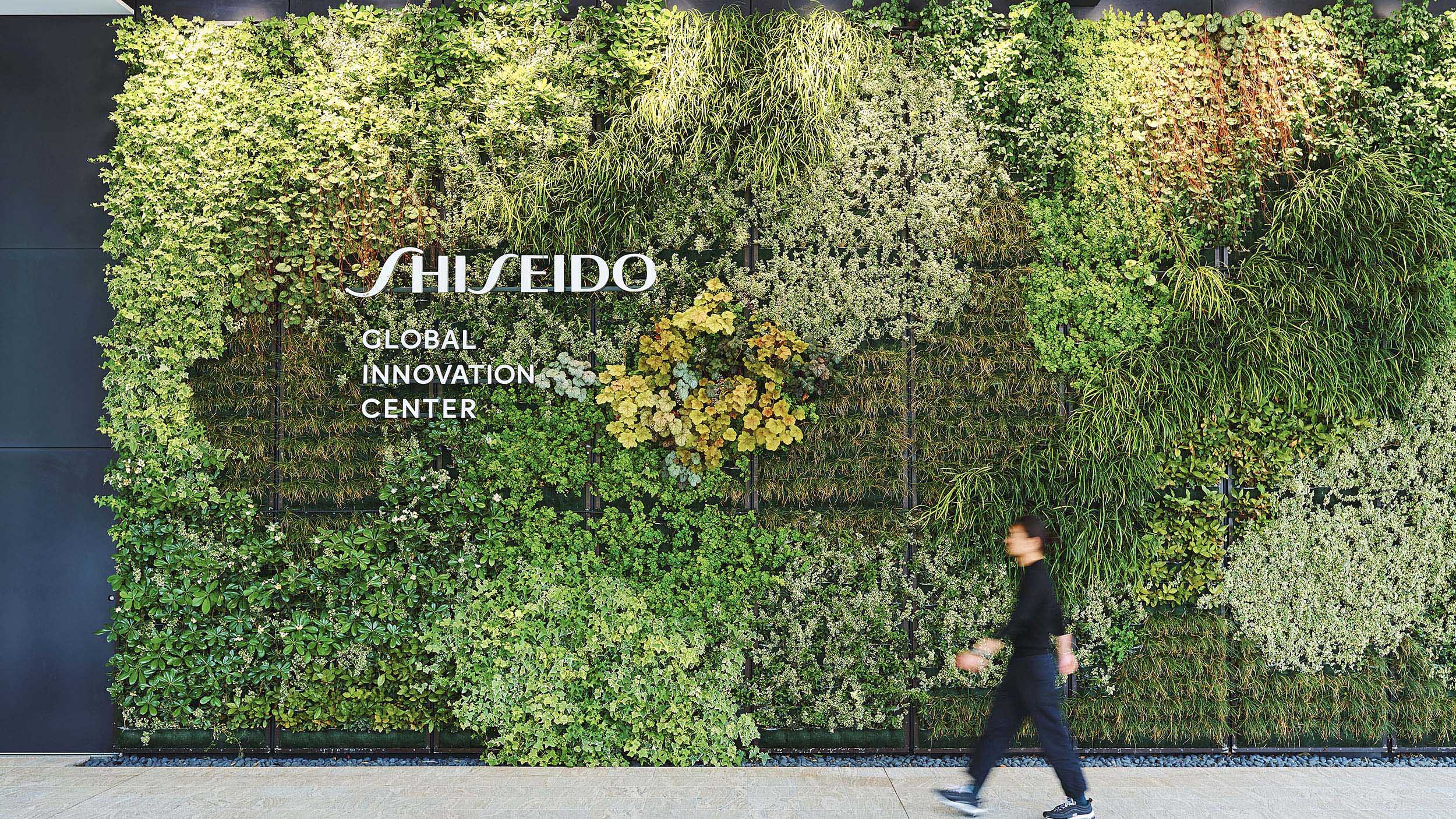
S/PARK CI & Signage
Scope
Creative Direction
Art Direction
Credit
Executive Creative Direction: Yoji Nobuto
Art Direction: Kontrapunkt
Design: Ikki Kobayashi
Photography: Kentauros Yasunaga
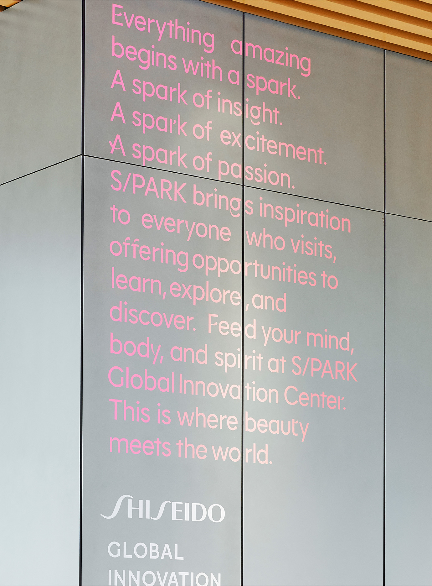
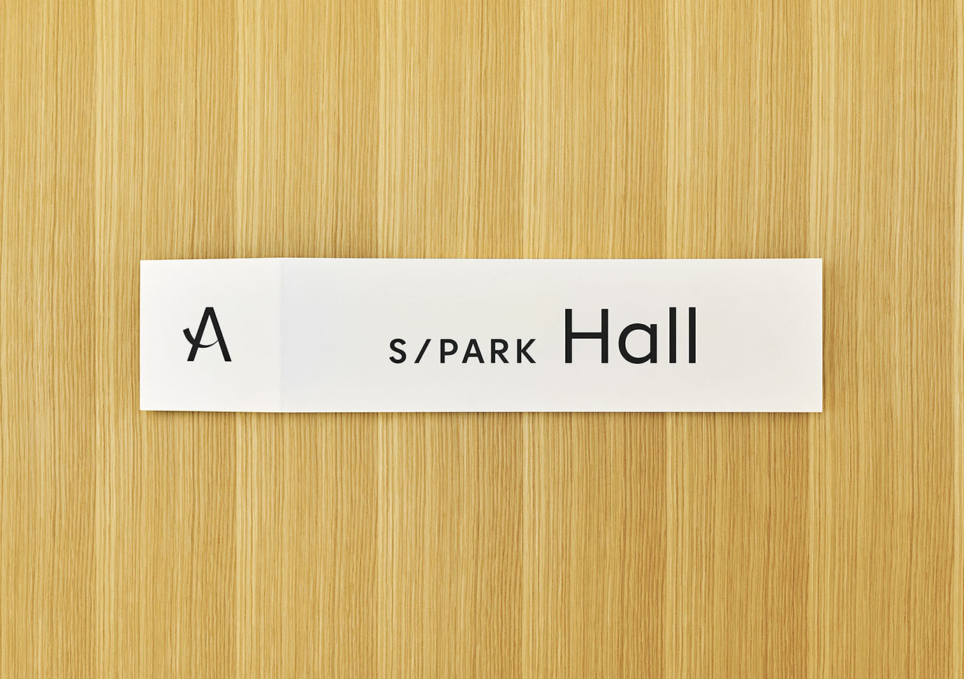
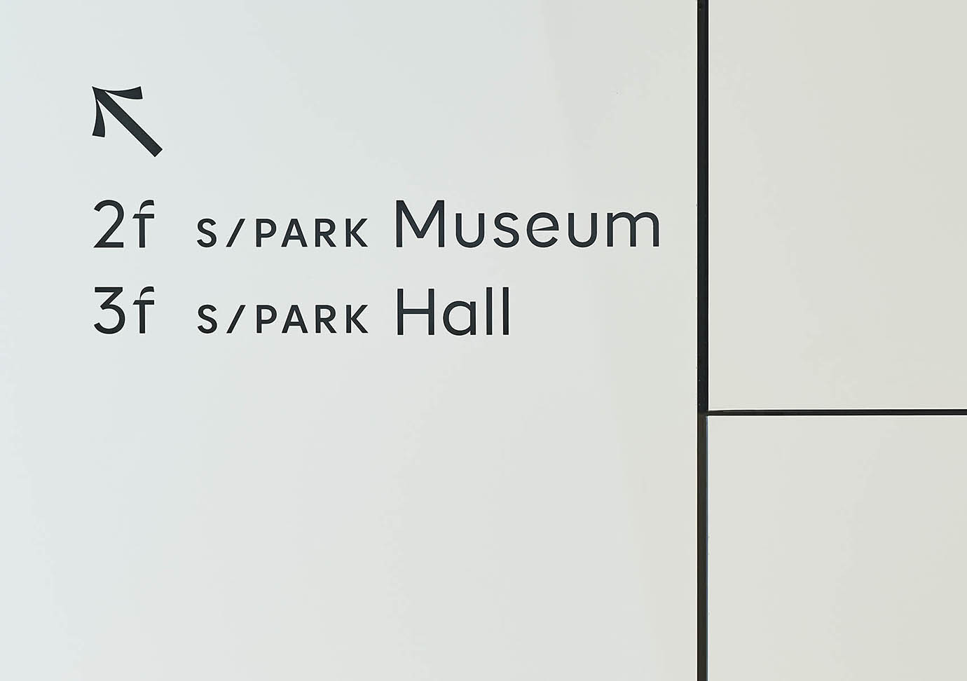
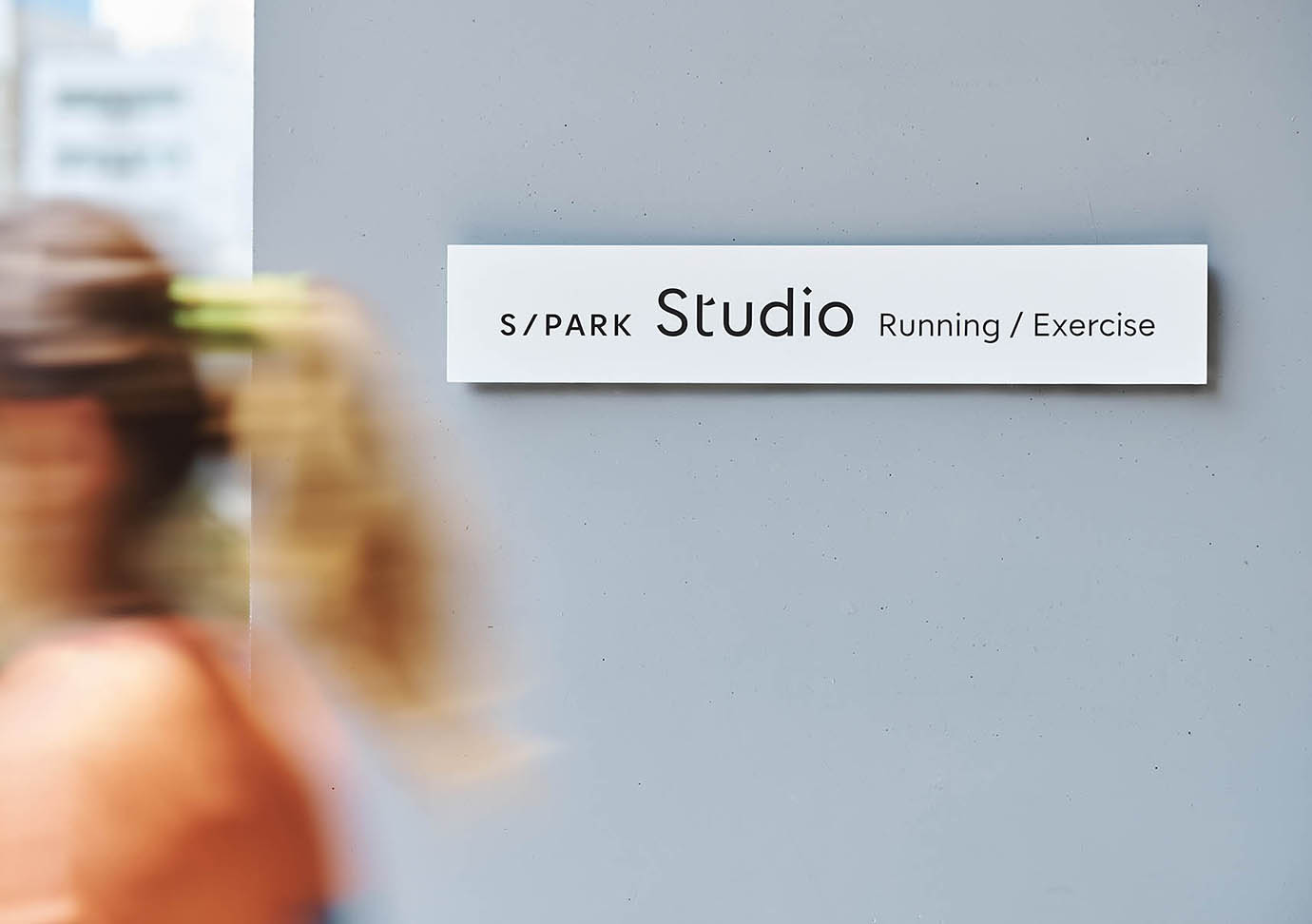
S/PARK is a new beauty complex built for Japanese beauty company SHISEIDO. The company struggled to win the global market and reconsidered ways to convey their key message, Modern Japanese Beauty.
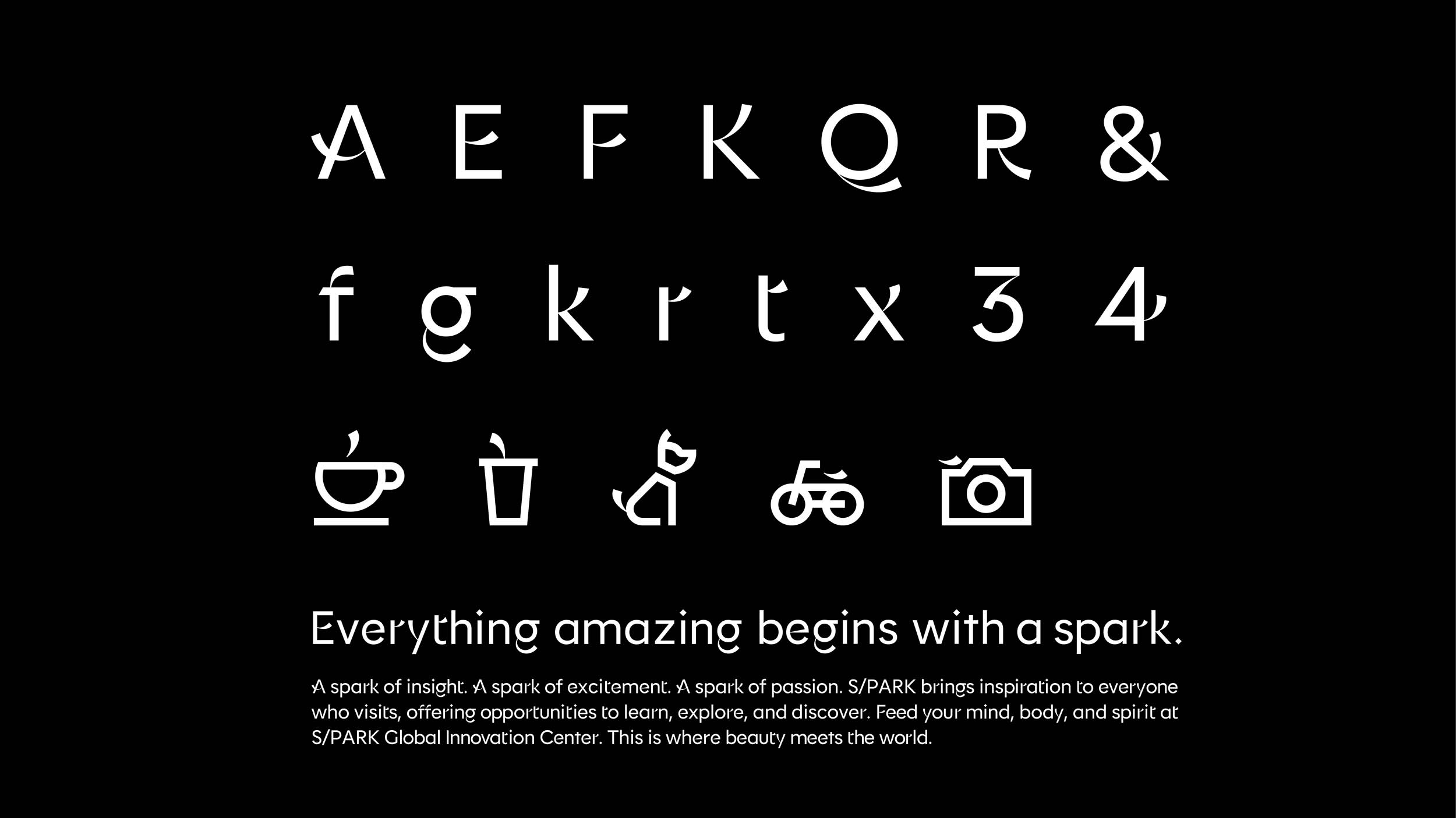
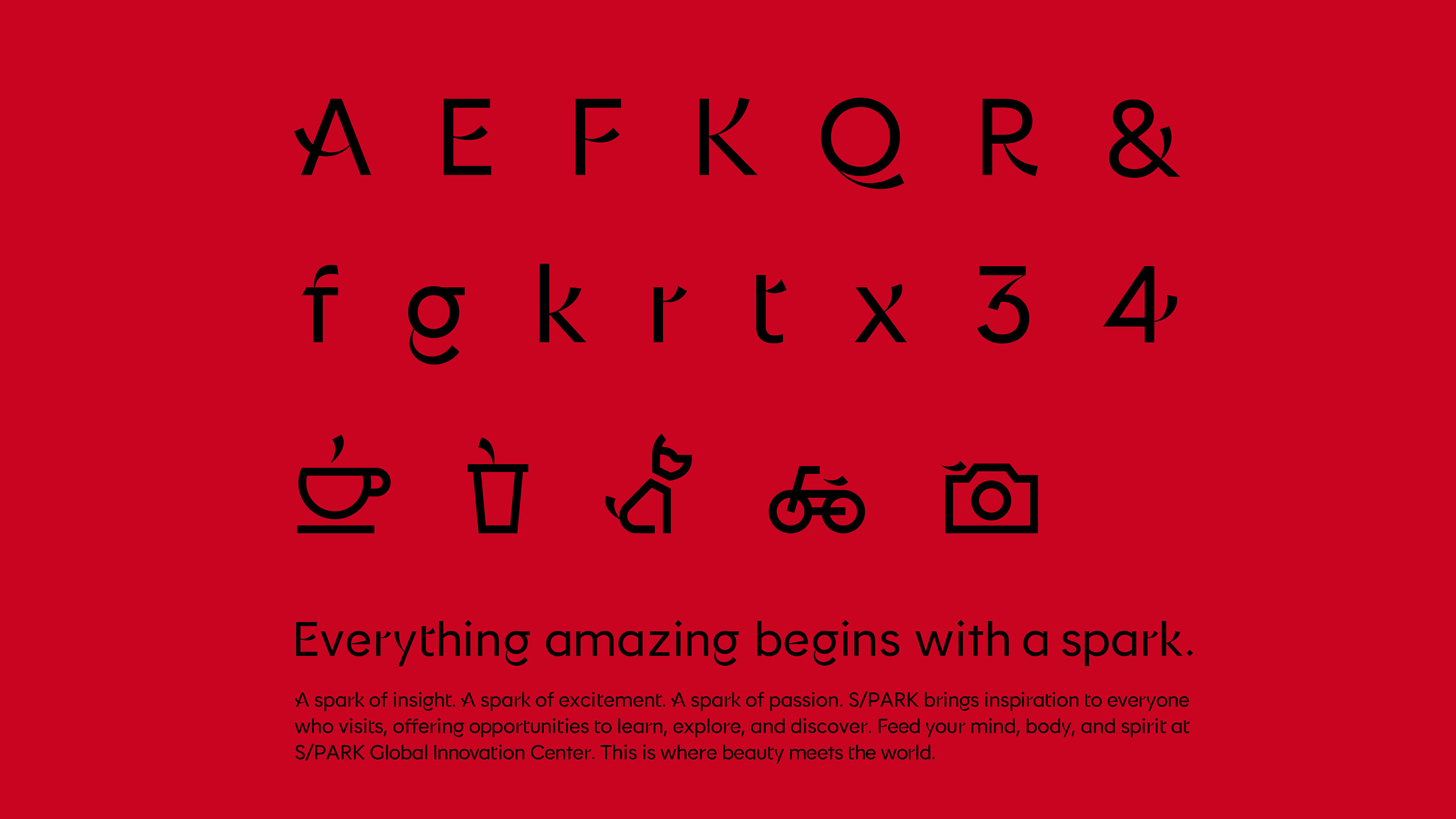
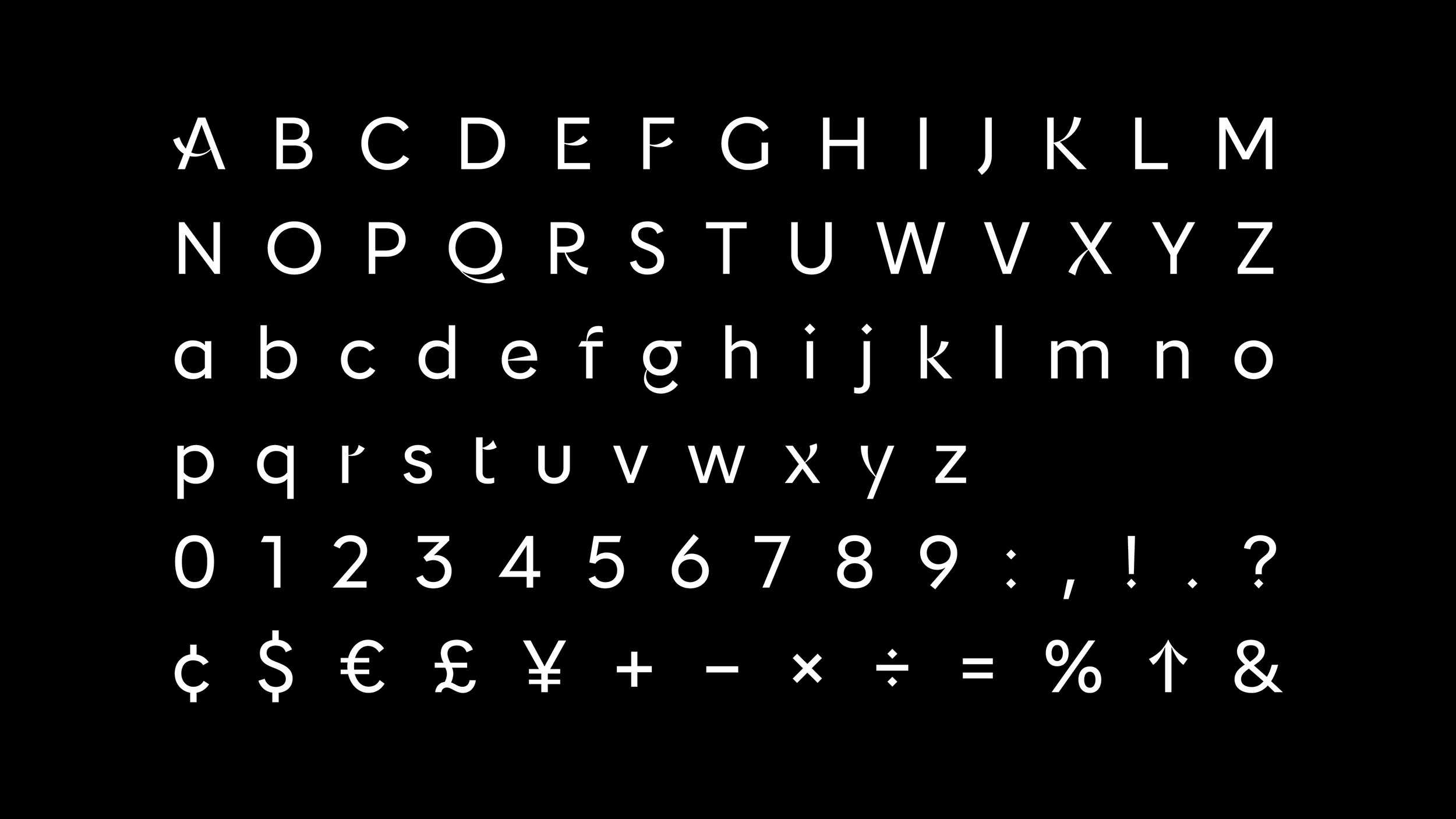
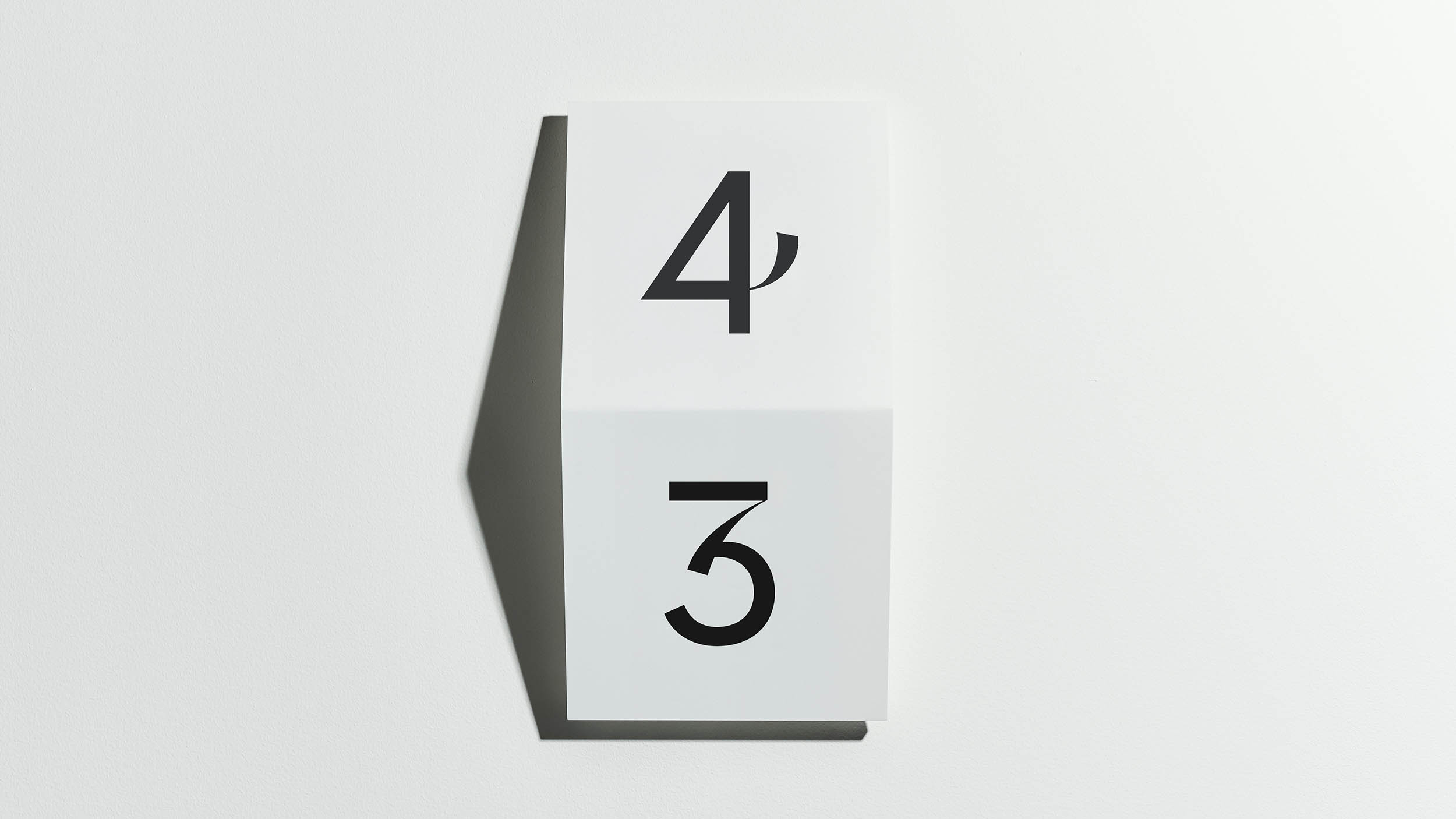
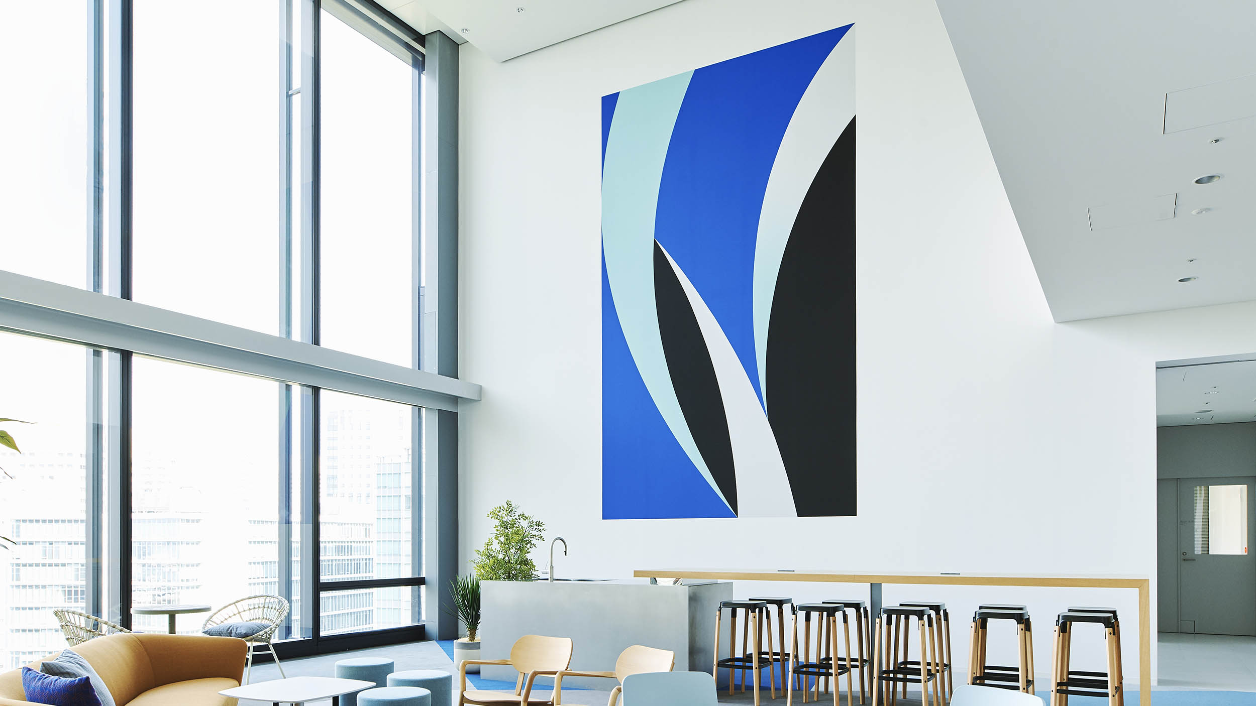
We first focused on SHISEIDO’s own typeface that had been used for advertising and packaging for over 100 years. Then, we created a new font and logos using components of the Japanese word ‘bi’ meaning beauty represented in the typeface. We wanted to create a design that conveyed Japaneseness to global consumers by using SHISEIDO’s typeface, one of the company’s historical assets. It was challenging to make the design look modern rather than classic while preserving the essence of the original typeface.
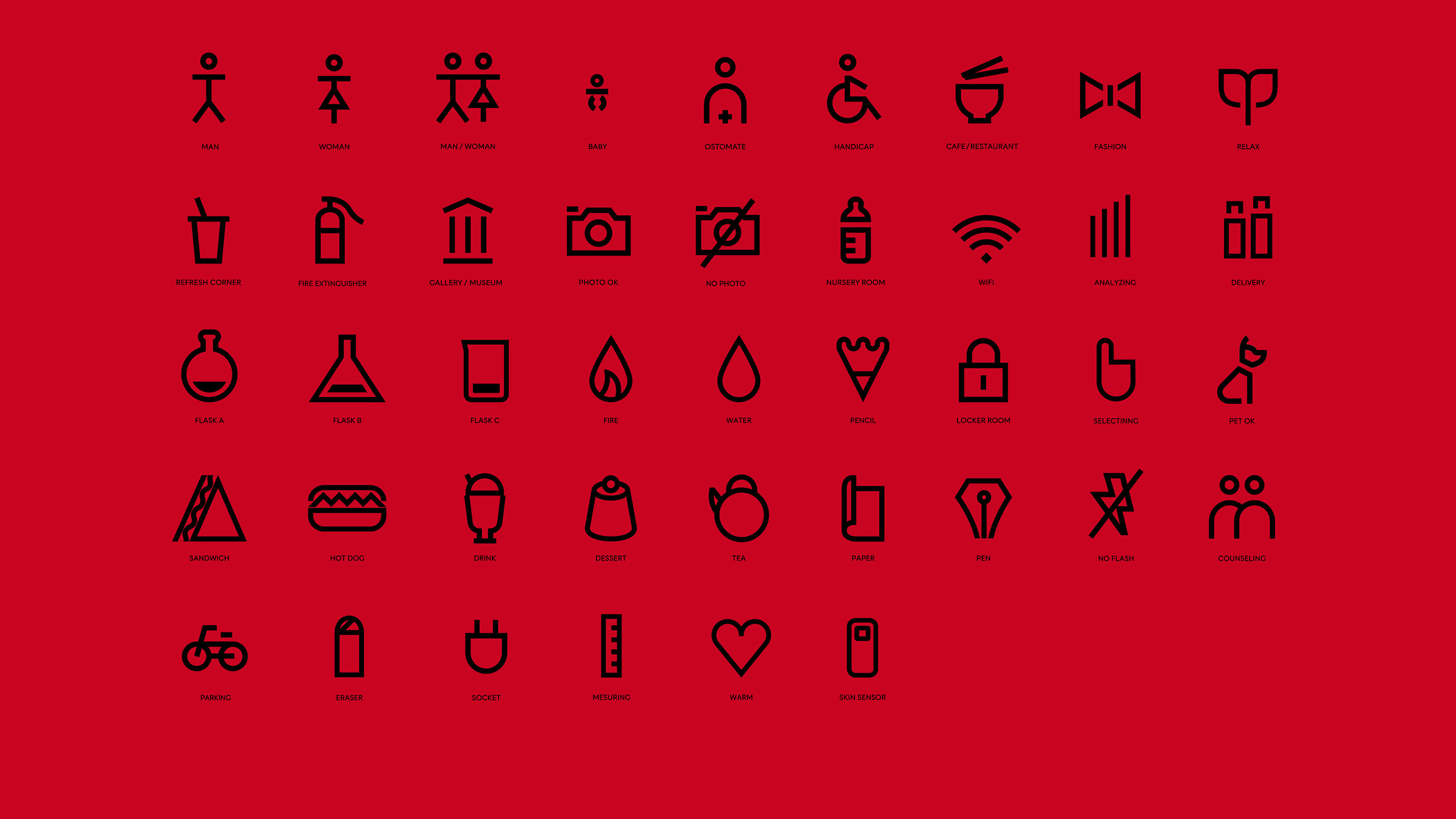
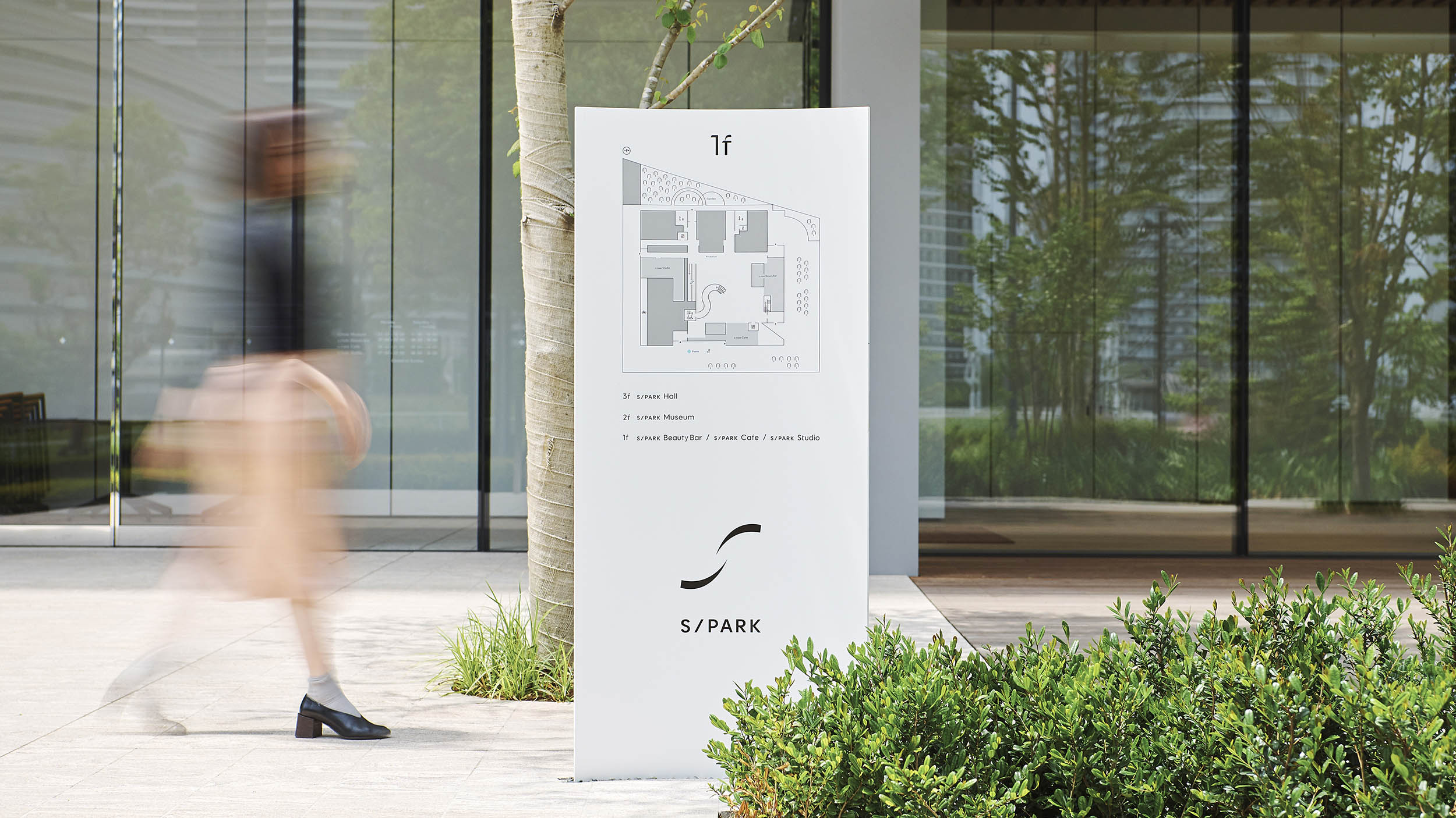
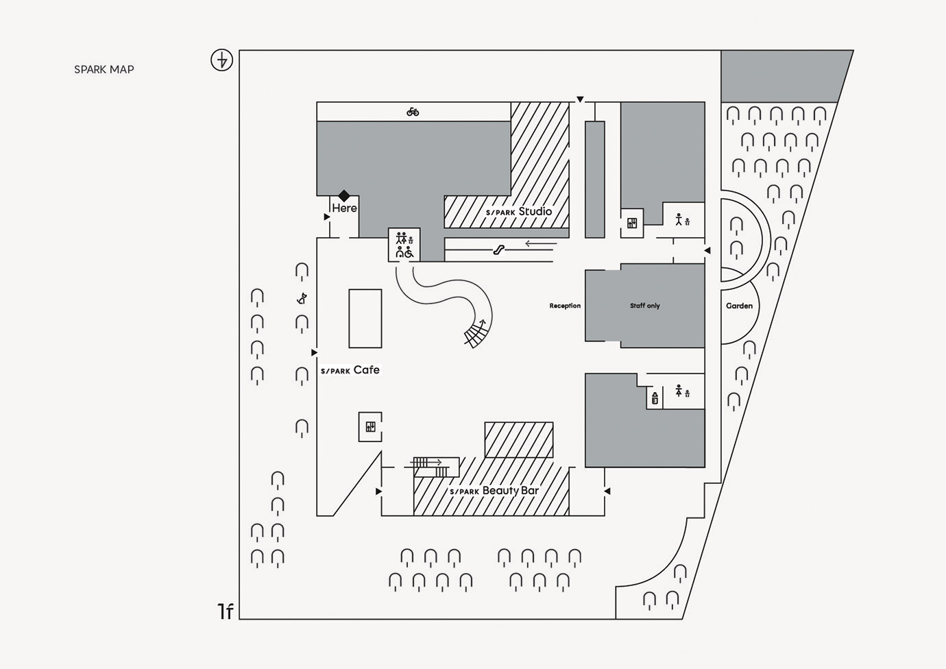
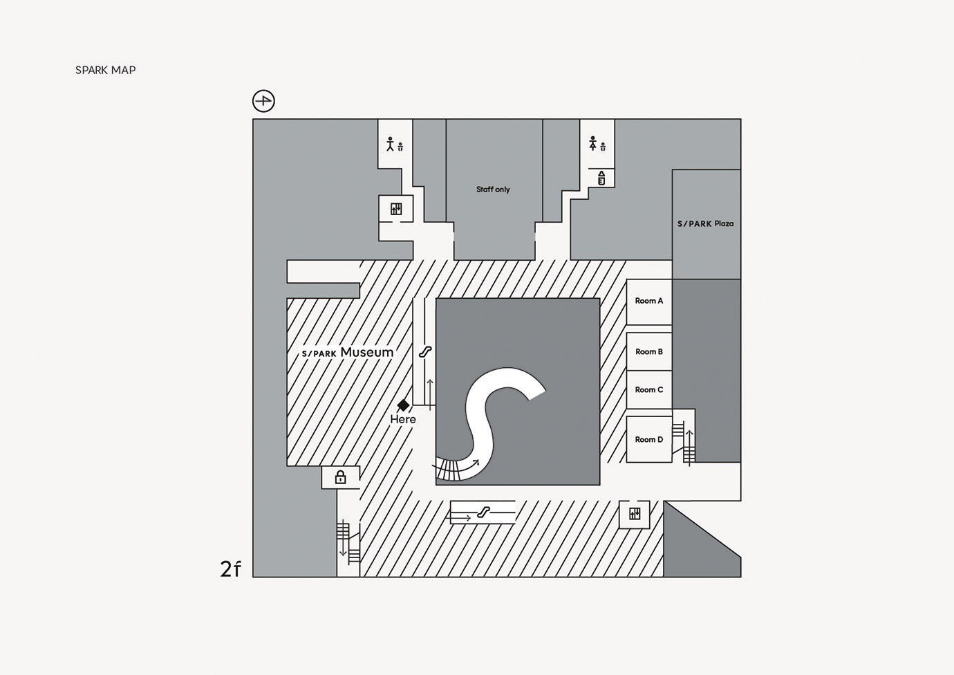
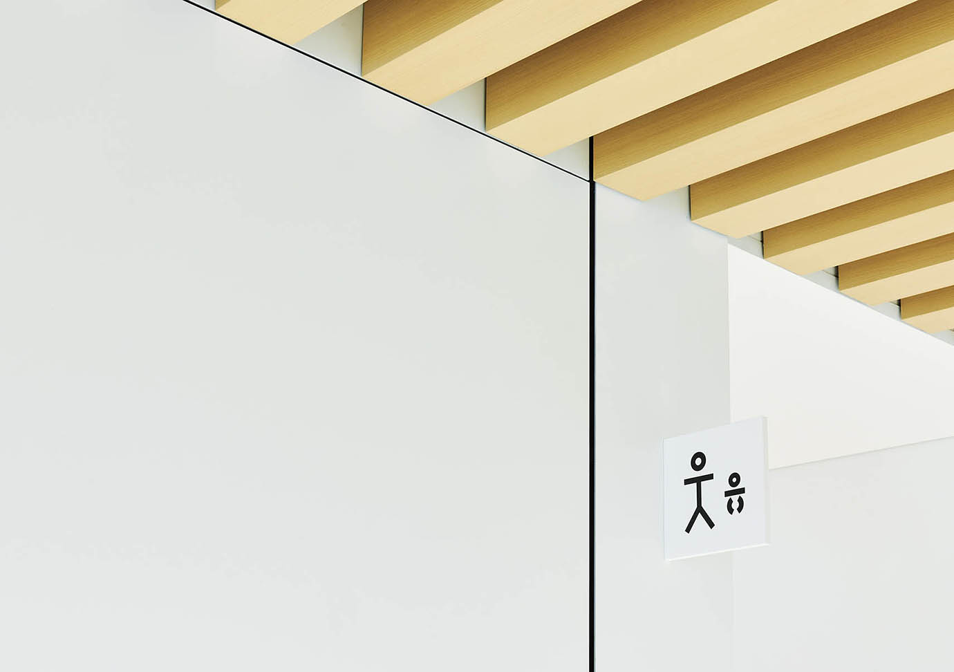
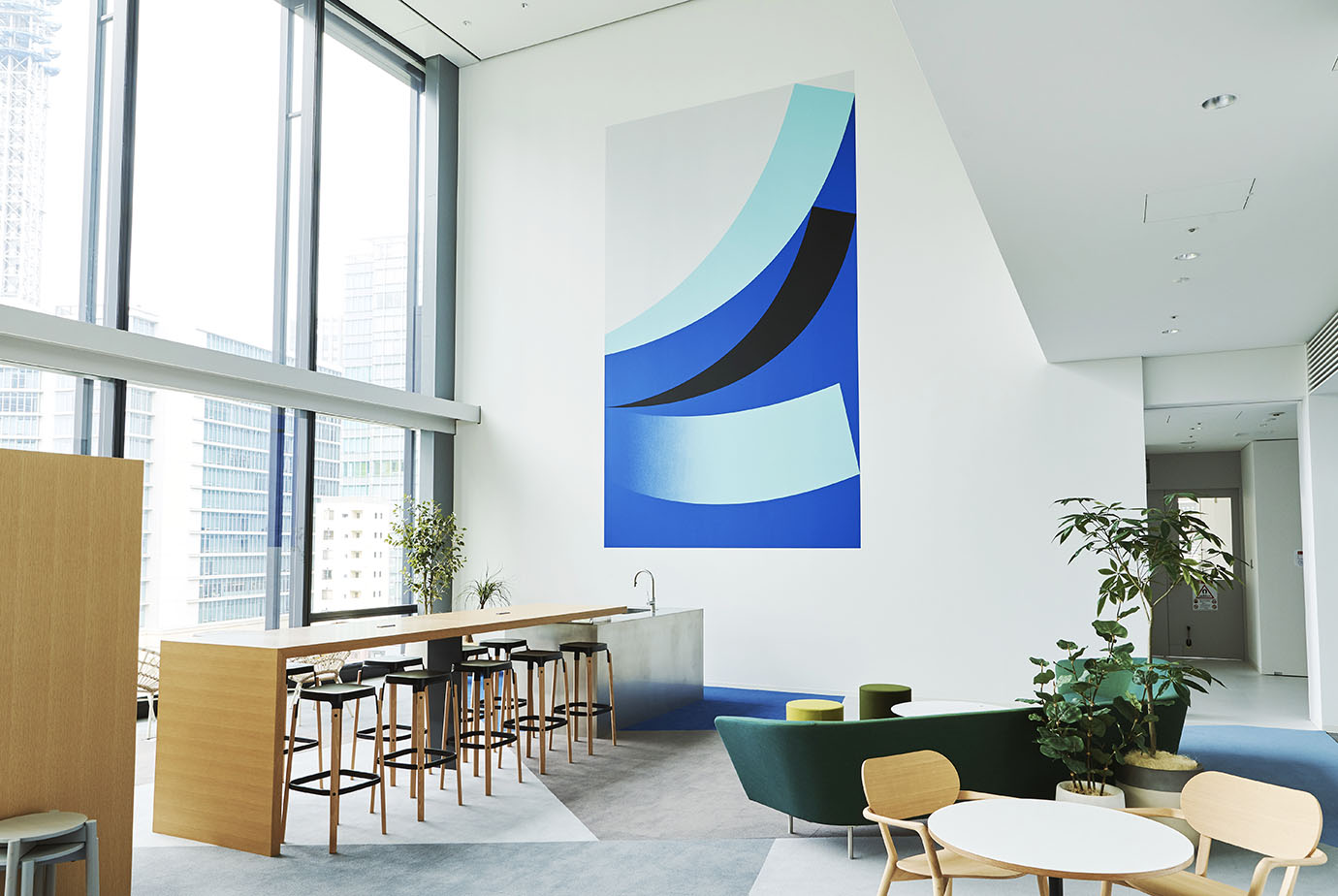
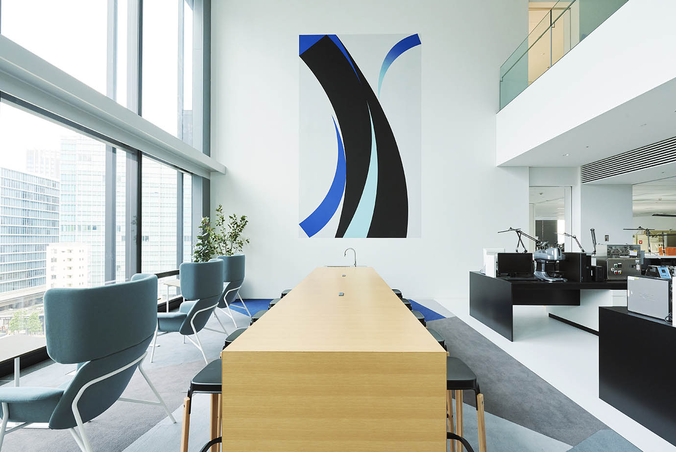
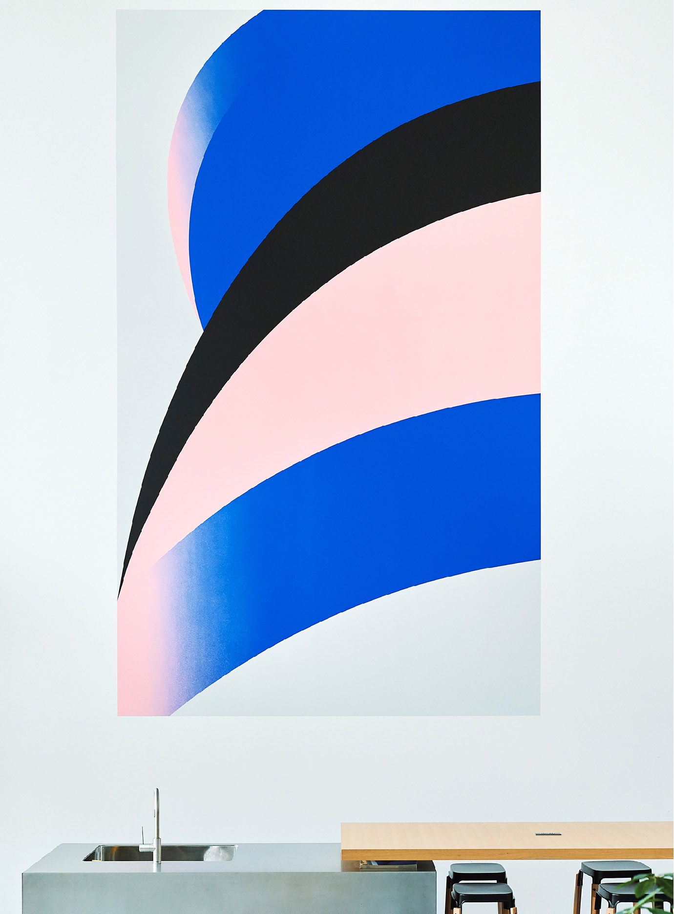
This concept has been reflected in all the media for S/PARK’s brand consistency, from posters and spatial composition, including signage and wall design, to items sold at a cafe in the complex, stationery goods, and on its website. The design that embodies Japaneseness has attracted great attention not only from Japanese people but also from global consumers.