LIPSTICKS
Scope
Creative Direction
Art Direction
Design
Credit
Photography: Shotaro Ito
Produce: Saki Hashimoto
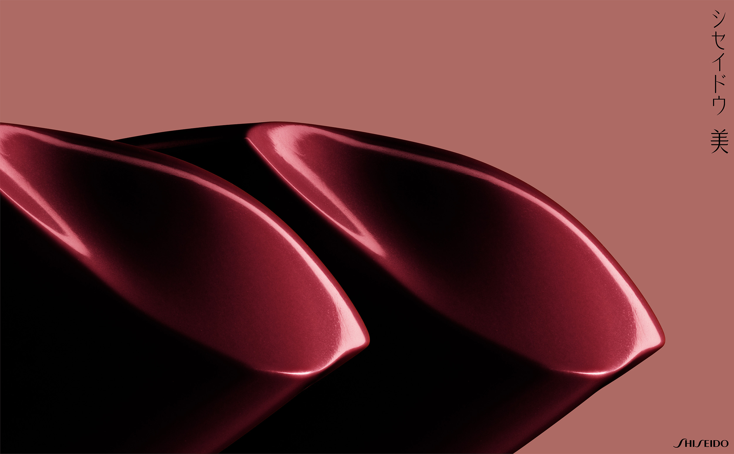
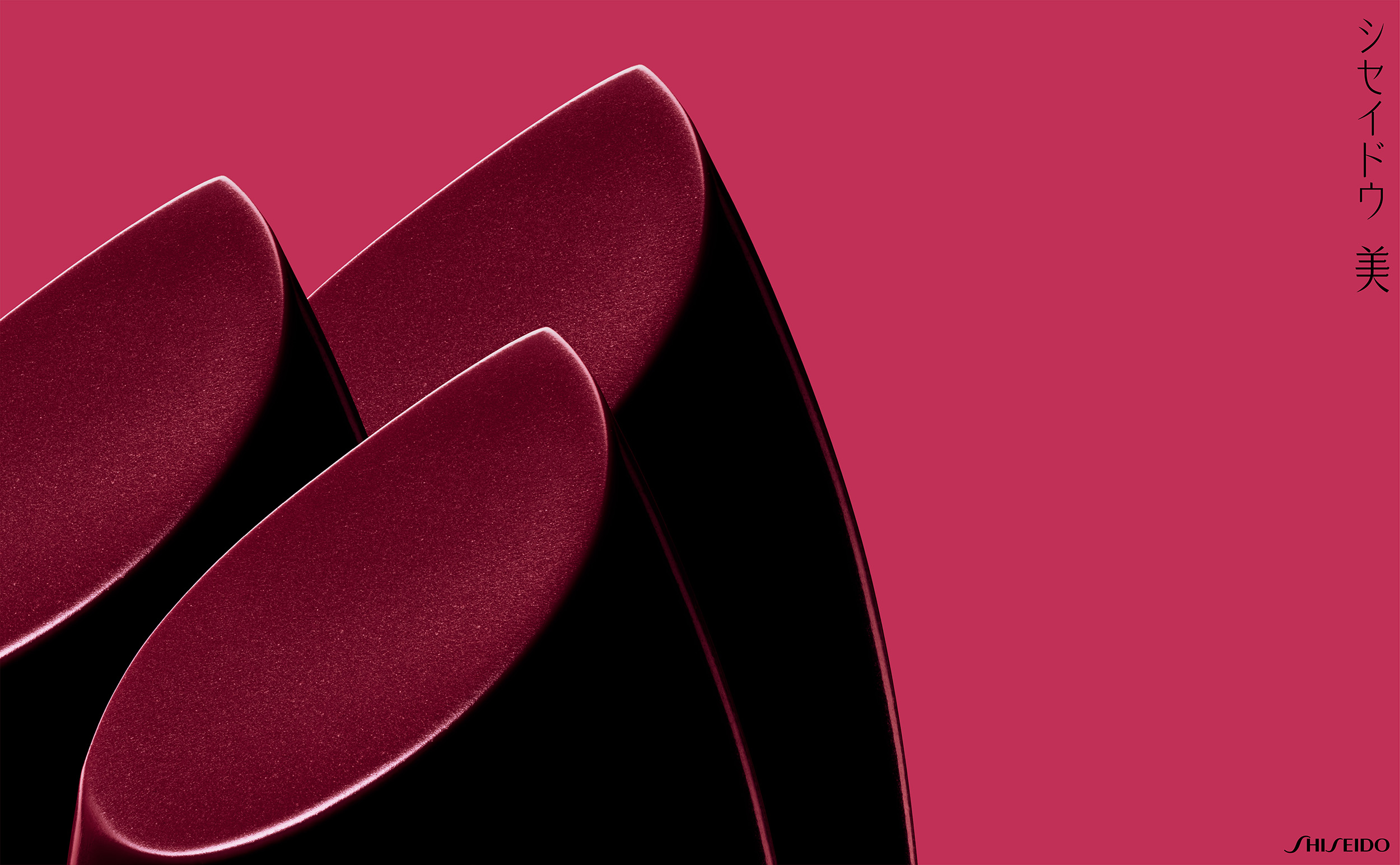
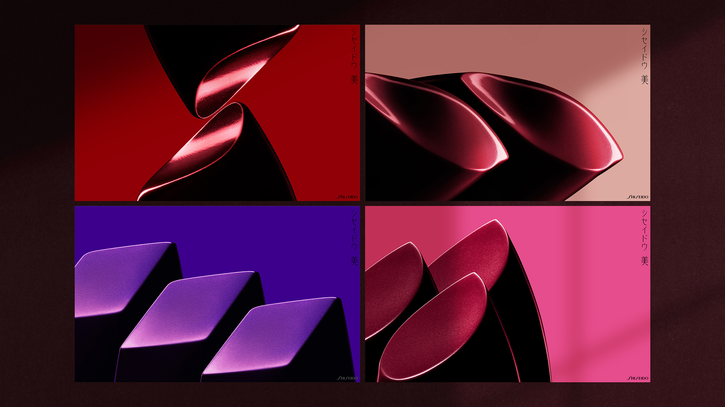
The Pandemic has completely changed our lives – We have less in-person interactions and we have to keep our masks on. With that in mind, we considered a strong yet beautiful visual that symbolizes the brand to evoke and empower global consumers aiming to encourage global consumers’ desire to put on lipsticks again for the sake of beauty – Even during a pandemic.
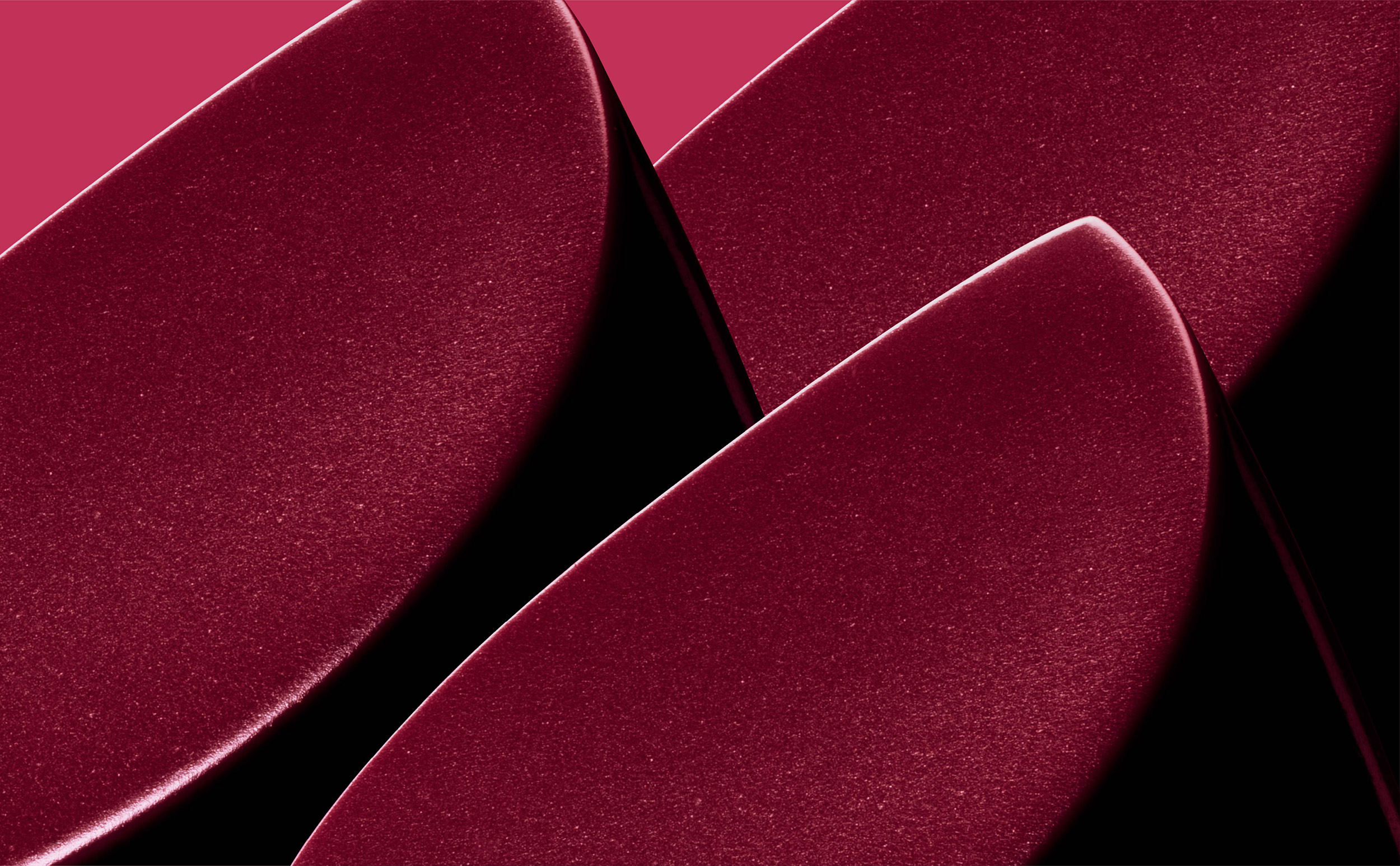
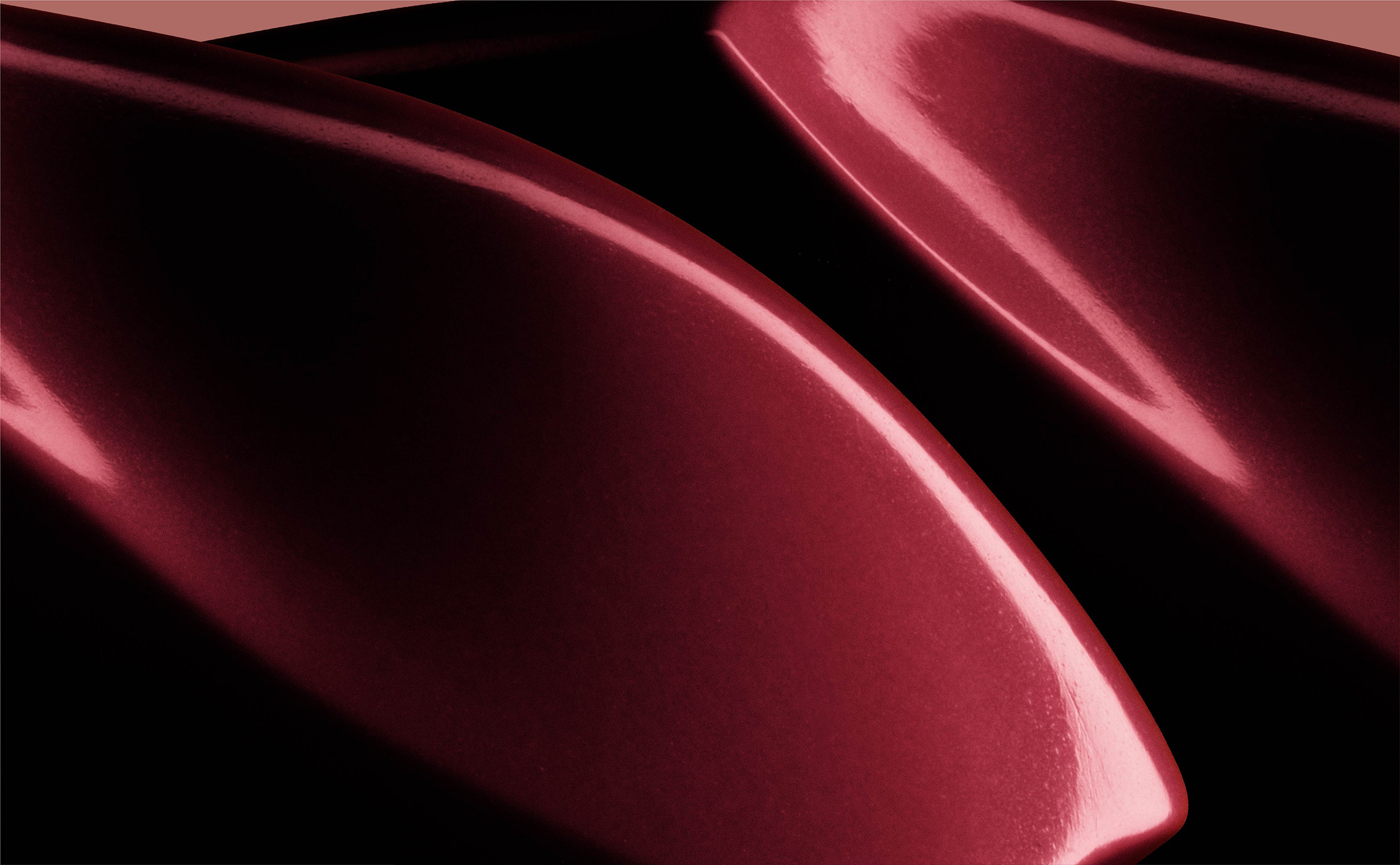
The visual is a super close-up photo of lipstick in about 1cm (half inch) in diameters whereas the actual poster size isH1m x W1.7m (H40xW63inch) – The poster size is about 100 times larger than the actual lipstick. Additionally, by incorporating the golden ratio into the photograph compositions and designs, it conveys the beauty of SHISEIDO to global consumers through universal beauty. We believe the beauty within a micro-world of 1cm has the power to drastically change the customer’s emotions and actions.
The Japanese headline means “The beauty of SHISEIDO.”