IREP
Scope
Concept Development
Corporate Identity
Guidelines
Art Direction
Design
Credit
Creative Direction: Gen Kogusuri
Produce: Takeshi Eguchi
Motion Graphics: Kakeru Mizui
Music: Black Cat White Cat Music
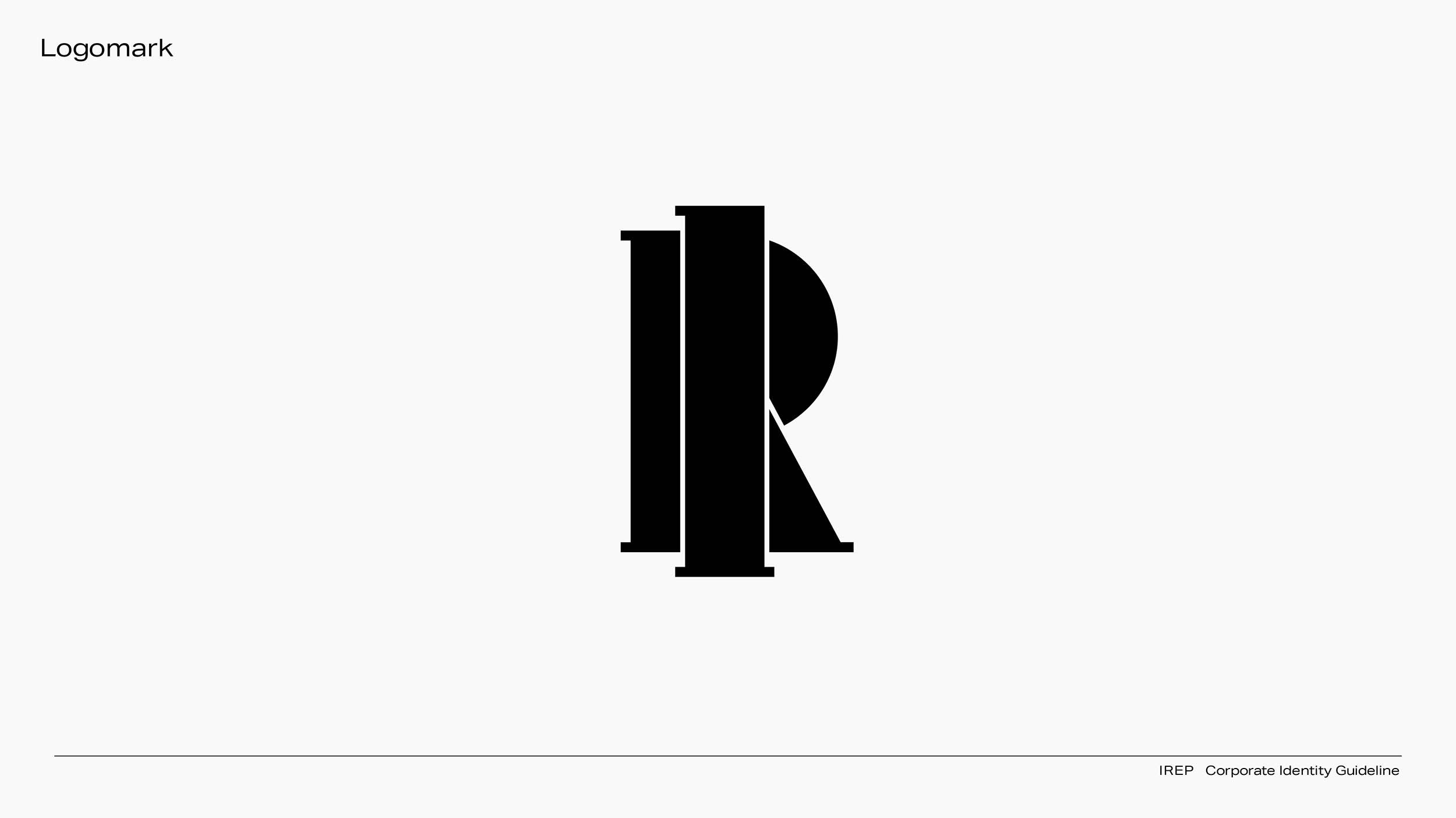
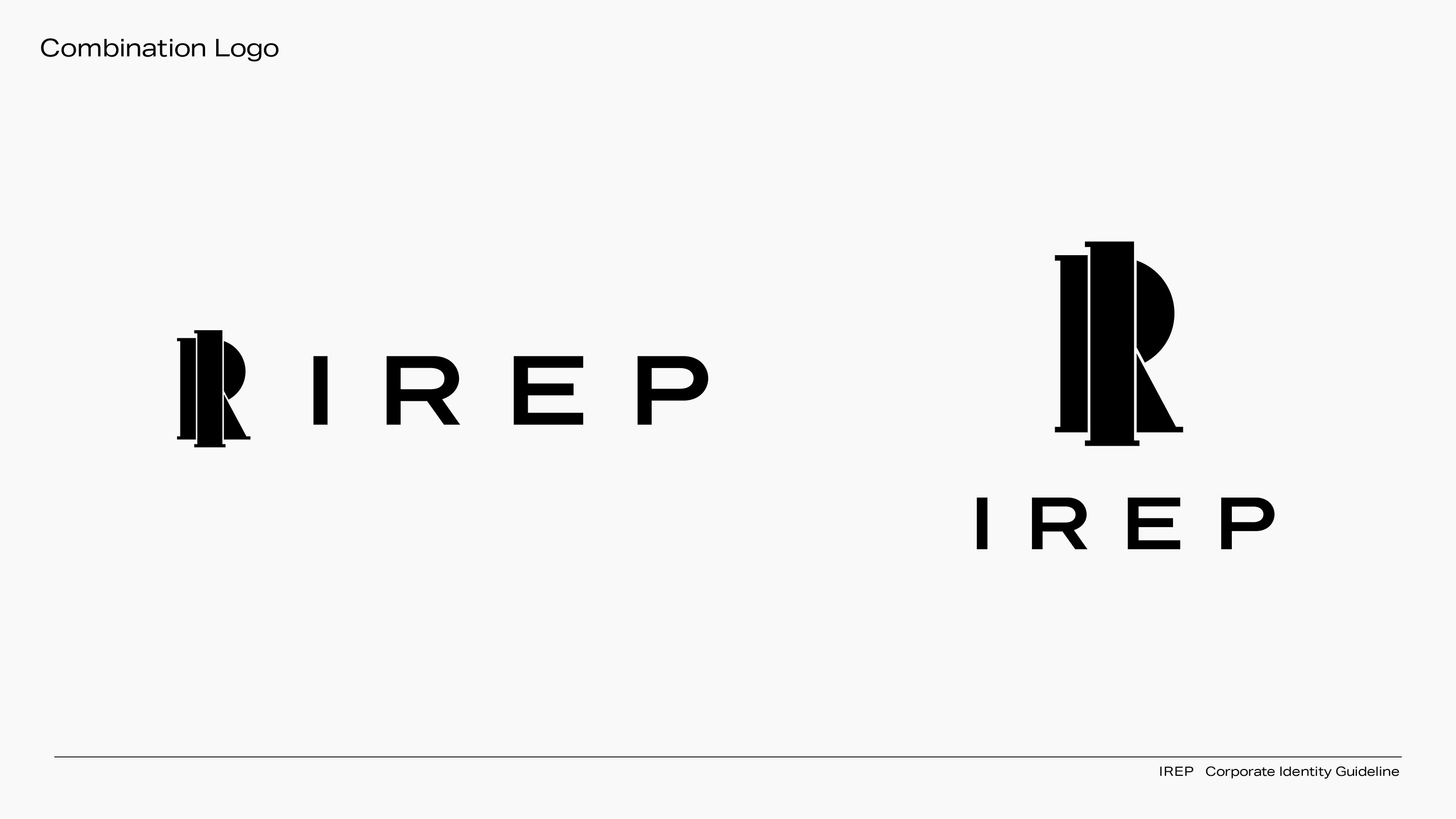
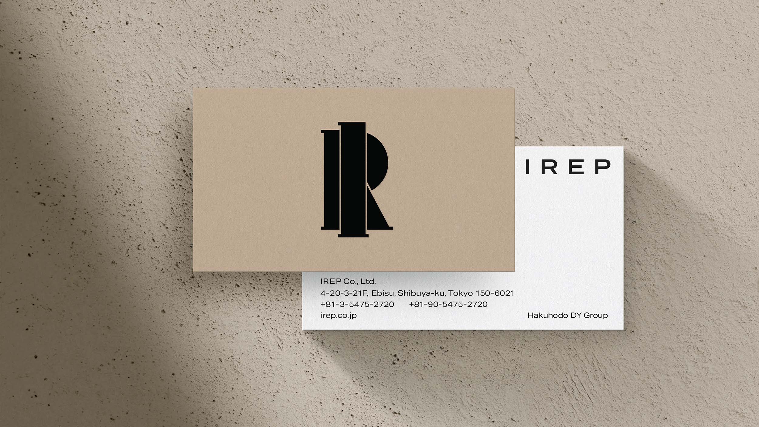
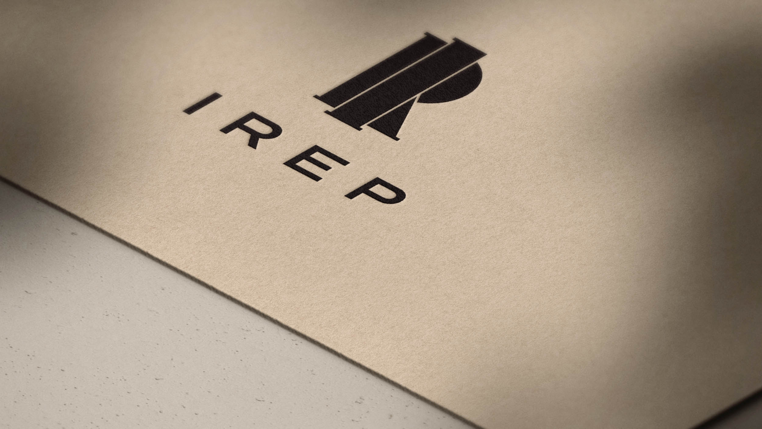
This was a rebranding for IREP, one of Japan’s leading digital marketing agencies. IREP has a corporate philosophy of being a partner that makes the world a better place by staying close together with its customers and users to continuously improve the current situation. The concept was about a company representative who supports customers through the brand and services – The corporate identity devised those two important letters, ‘I’ and ‘R,’ overlapping to showcase the corporate philosophy through the concept.
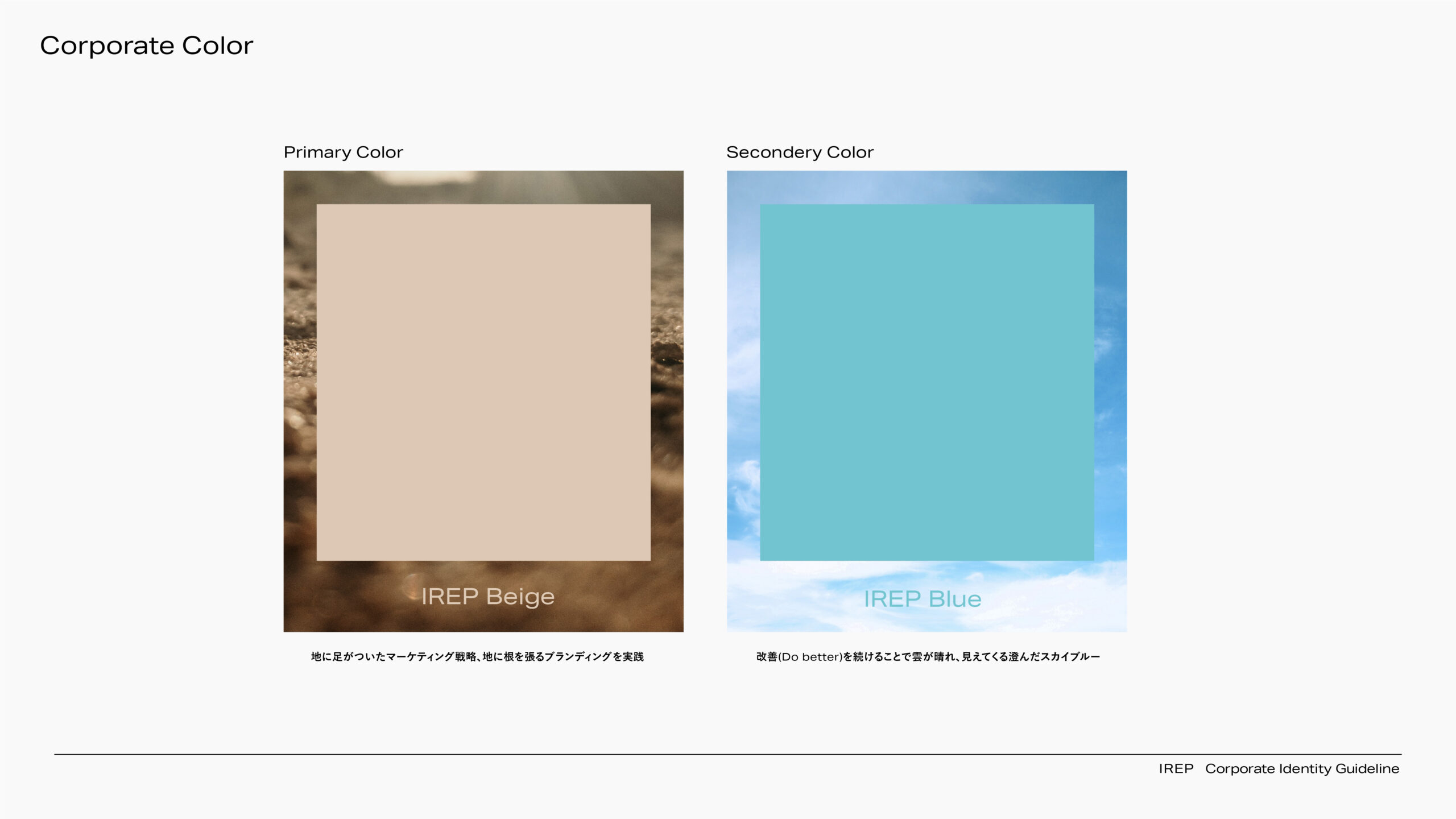
Regarding the corporate color, the primary color, beige, was chosen to represent the image of earth, as the company is committed to a sincere and down-to-earth marketing strategy. The secondary color, on the other hand, represents the clear blue sky color that becomes visible when the clouds clear through continuous improvement (do better).