Flower Typography
Scope
Art Direction
Design
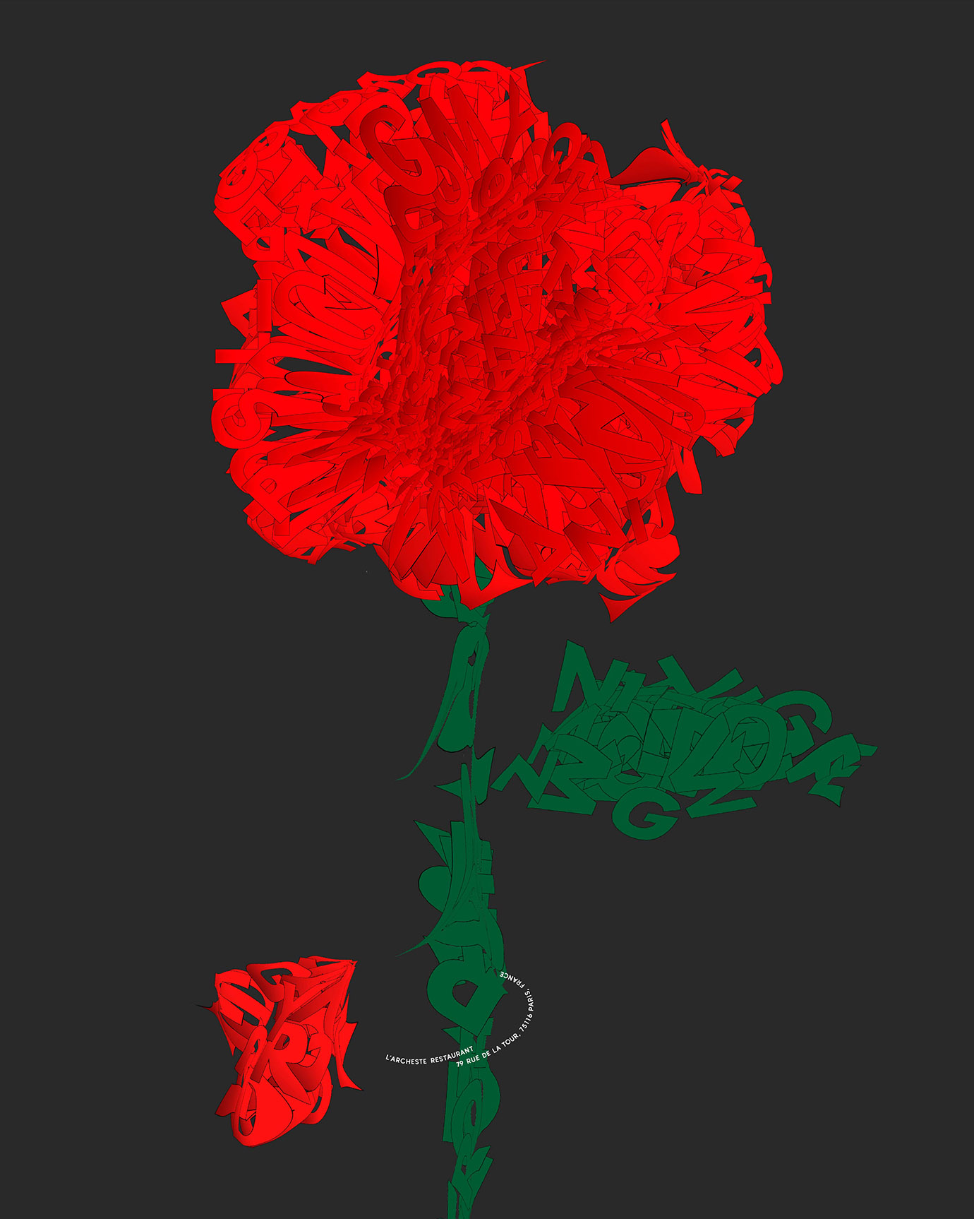
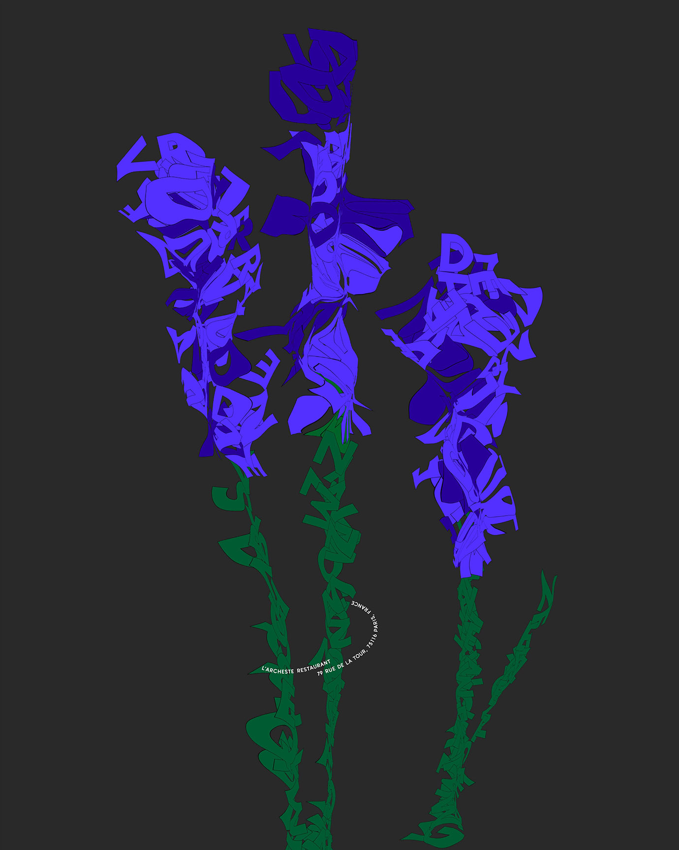
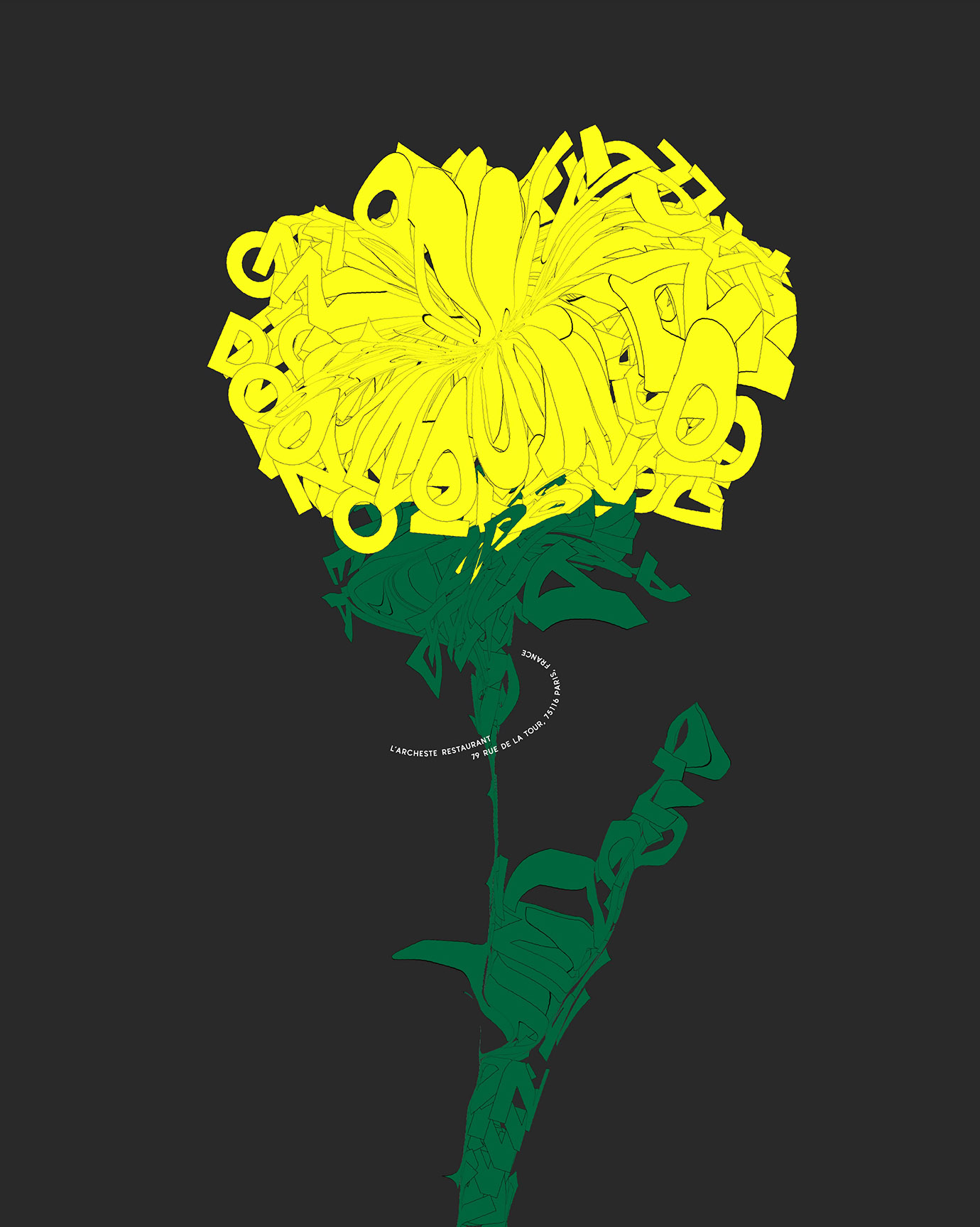
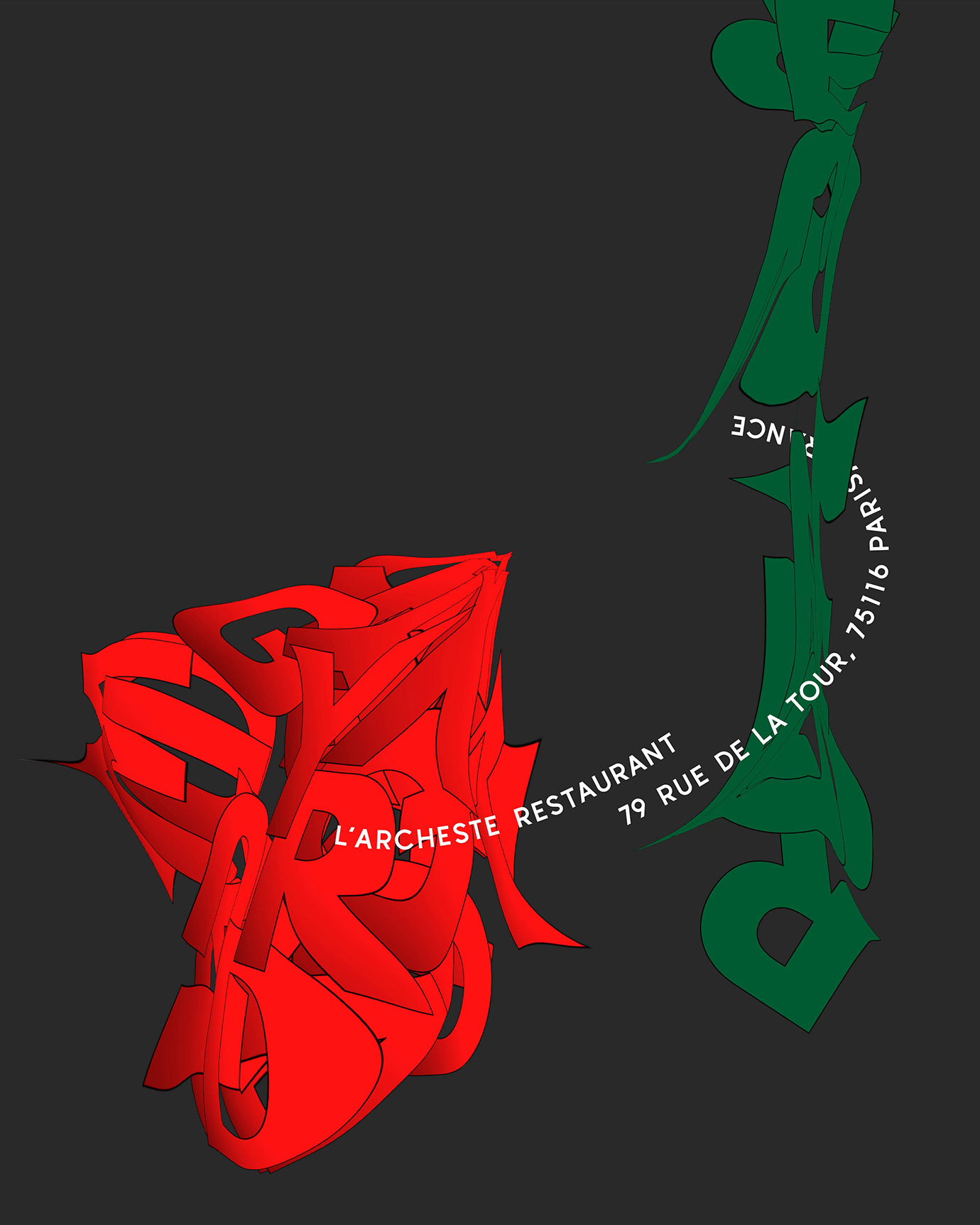
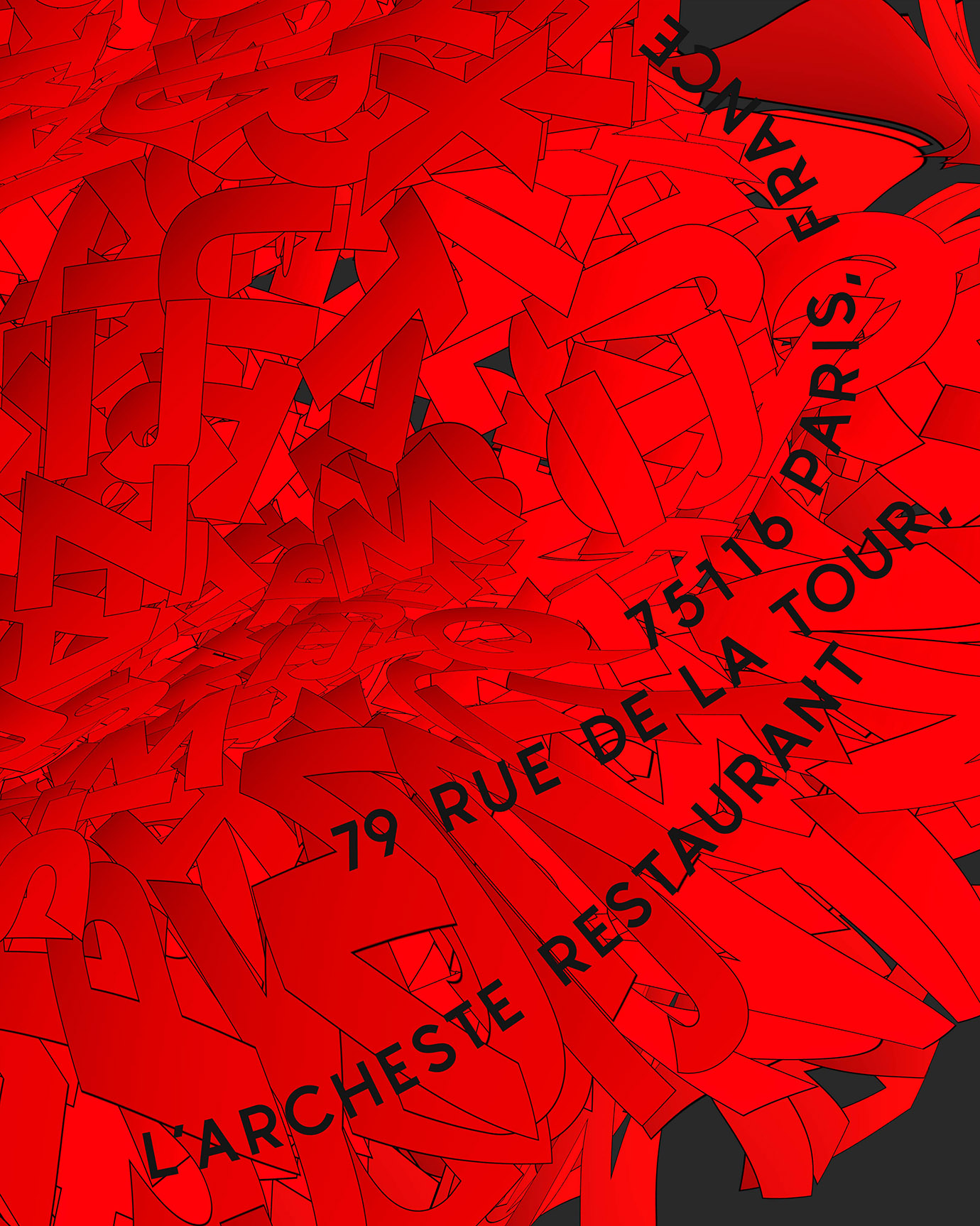
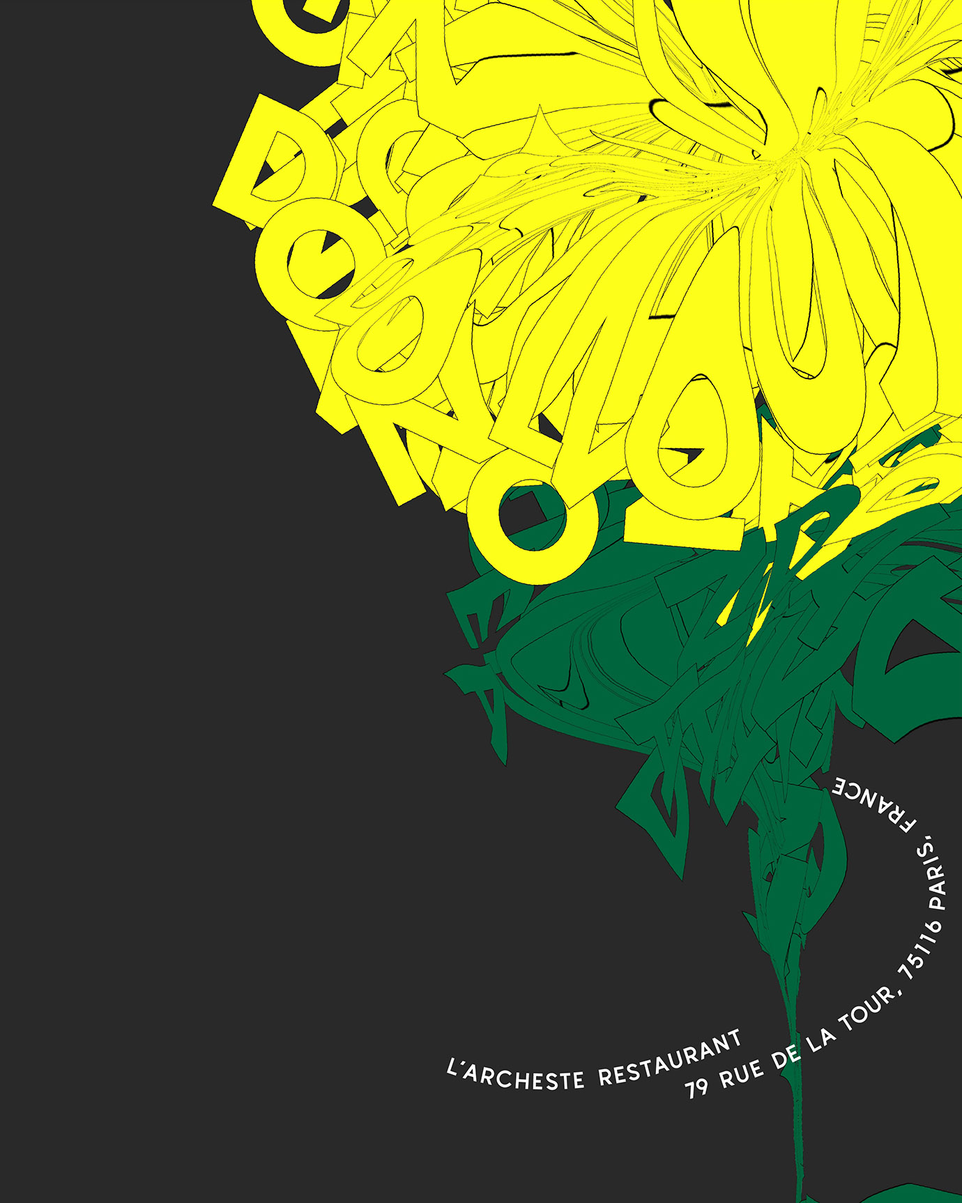
L’ARCHESTE is a Michelin-starred French restaurant in Paris owned by a Japanese chef. The name L’ARCHESTE means to reconstruct beauty which is the chef’s desire. He indeed creates beautifully presented classic French dishes with a Japanese twist that look like works of art.
These restaurant posters were produced for seasonal pop-up events. We decided to use flower motifs reminiscent of Japan to enable Parisians who were yet to know the restaurant to feel the essence of Japanese beauty. As the dishes served at the events would reflect the current seasons with color themes, we discussed with the chef how to choose the right flower types and colors, avoiding well-known Japanese flowers such as cherry blossom, which could detract from the originality of his dishes. We used letters of the alphabet to depict the motifs abstractly and artistically. The posters created a distinctive atmosphere that was perfect for the chef’s highly creative dishes.