Black and Red
Scope
Creative Direction
Art Direction
Design
Credit
Photography: Shotaro Ito
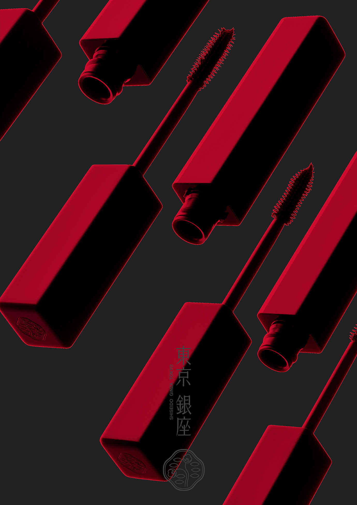
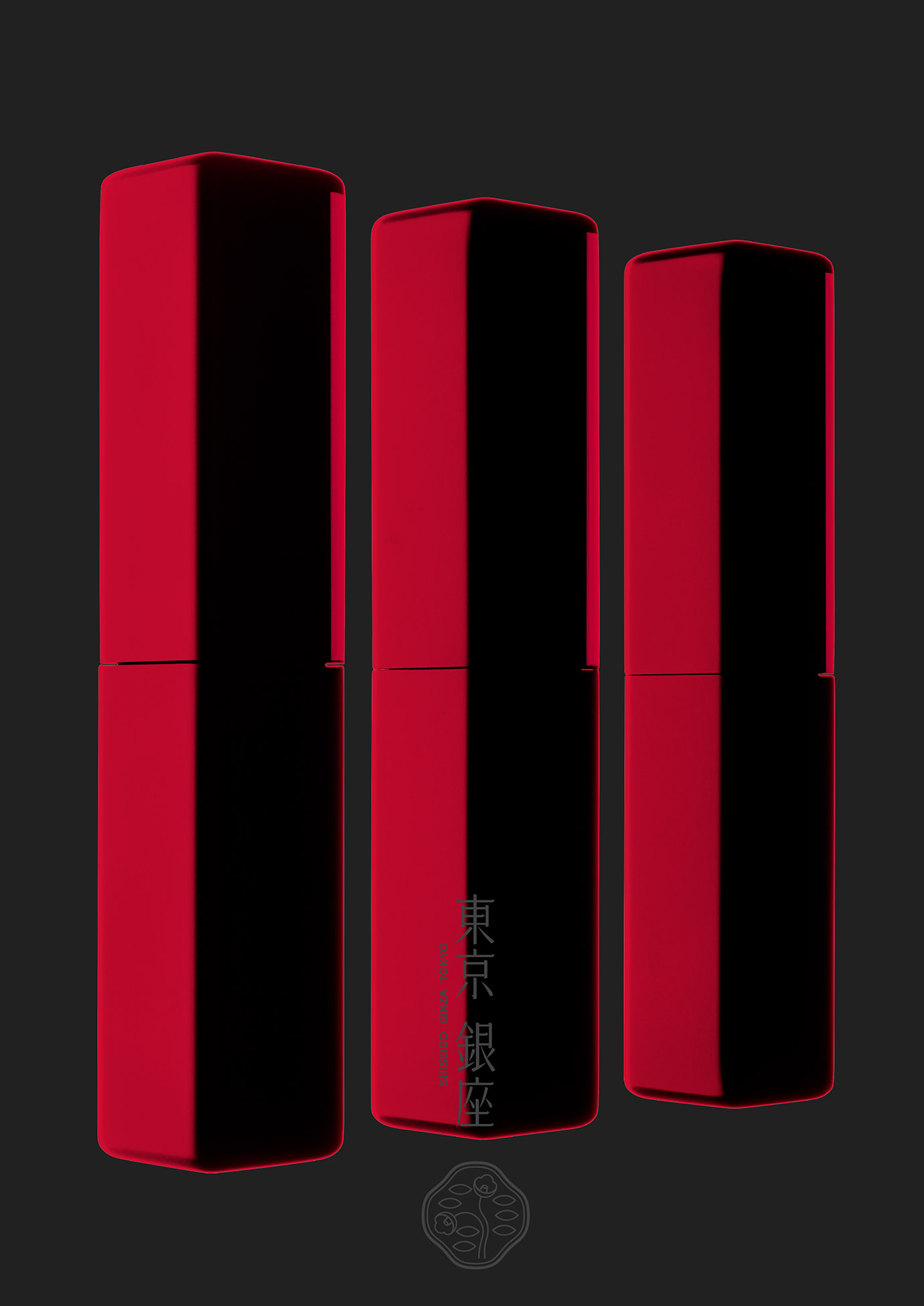
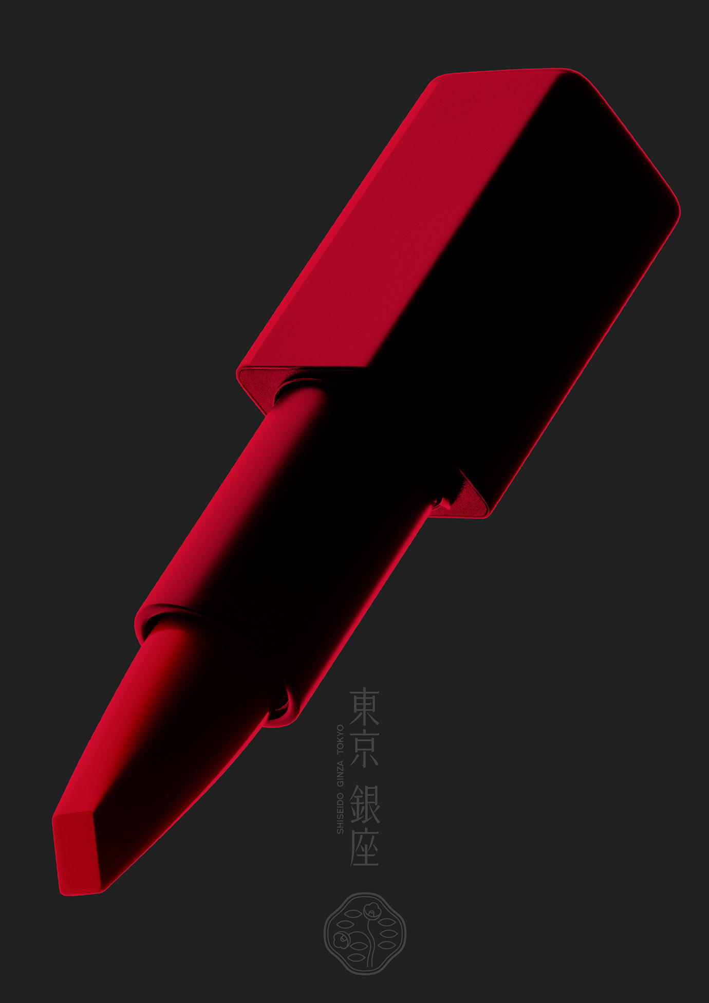
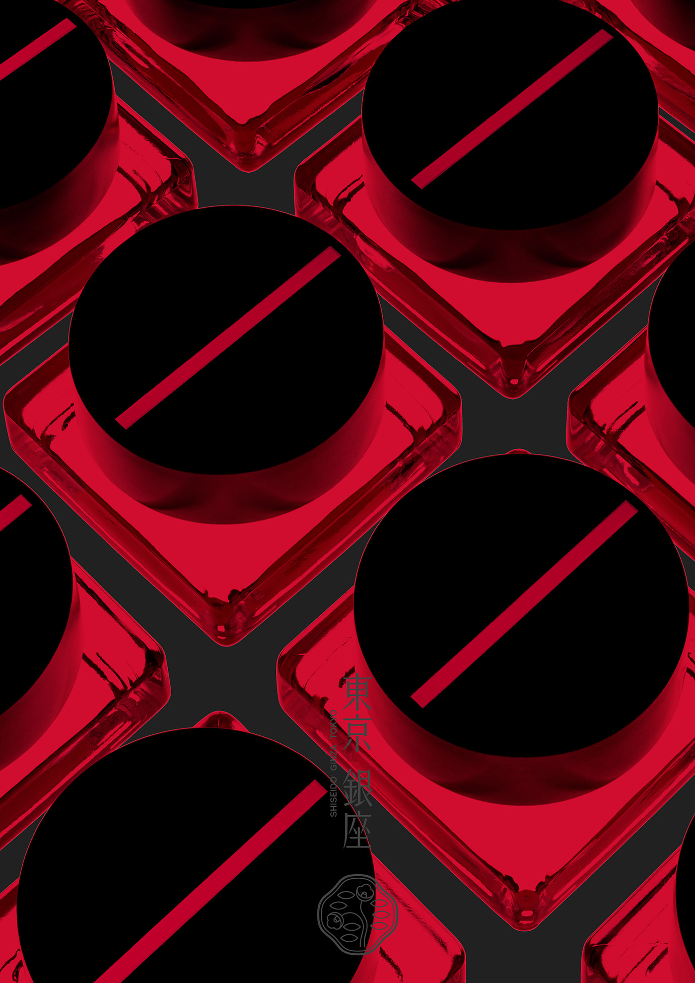
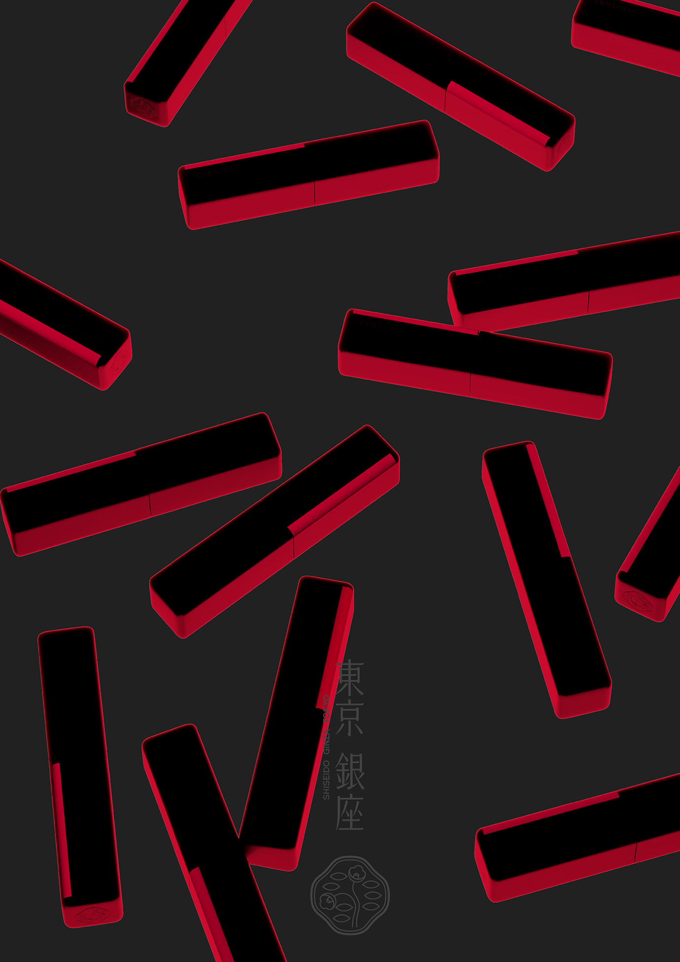
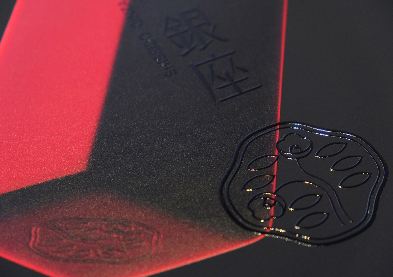
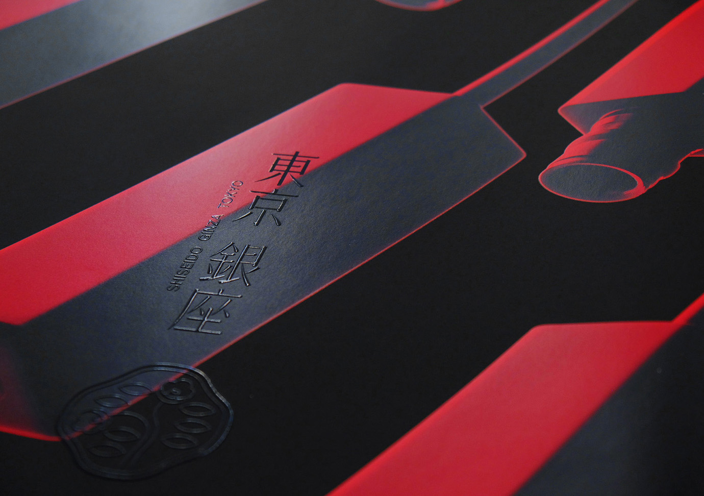
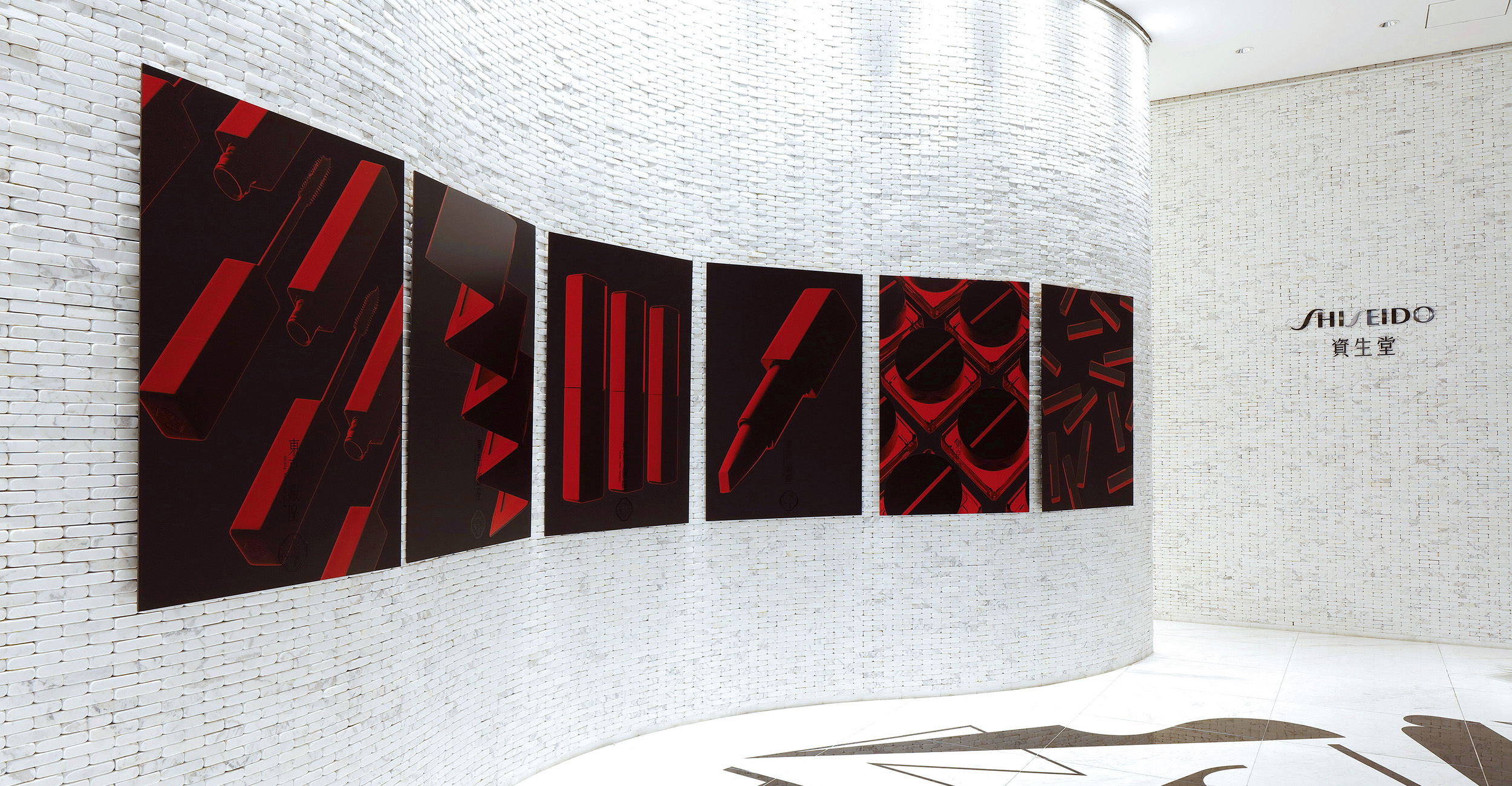
SHISEIDO is a Japanese cosmetics brand that sells its products in more than 90 countries worldwide. In September 2017, it fully revamped its makeup line and launched over 100 products. These posters were displayed at SHISEIDO’s headquarters as well as product launch events. The client asked us to produce visuals that express the product concept of “Modern Japan” and, furthermore, to create a unique brand image that distinguishes the brand from its western competitors. The product design incorporates a traditional Japanese color scheme with striking jet black and deep scarlet. To further increase the visual impacts of the posters, we changed the color of the bright part of the photographs to red so that only black and red are used for a minimalist look, which boldly expresses “Japaneseness.” This has worked as a way to differentiate the brand from its western competitors, contributing greatly to the sales of the products.